Ecommerce + Awareness
Your Ears Rock
Built an ecommerce and awareness platform for fashionable hearing protection, balancing product desire, education, trust, and conversion.
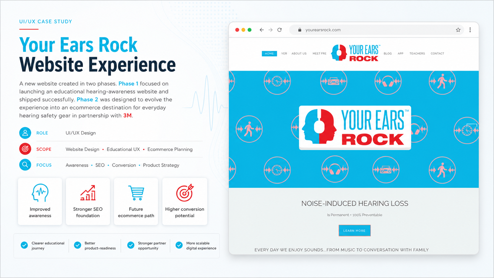
Your Ears Rock sold products that looked like audio gear but reduced sound, so the website needed to explain the category while still making the products feel desirable and easy to buy.
The website became a stronger ecommerce and hearing-awareness platform, growing from early organic traction and 1-2 monthly conversions to roughly 40-50 sales per week by the fourth quarter.
Role & Scope
I was hired as the Lead Web Developer to build a new ecommerce website for Your Ears Rock, a for-profit organization focused on selling fashionable ear protection wear.
While this was not a full UI/UX design role, the project required several UX-driven decisions around product positioning, ecommerce presentation, educational content, conversion flow, and analytics measurement.
The work sat at the intersection of web development, ecommerce strategy, product storytelling, and awareness-based content design.
Quick Context
Your Ears Rock sold fashionable ear protection products designed to reduce harmful sound exposure while still feeling wearable, stylish, and socially acceptable. The organization had partnered with 3M to distribute industry-level hearing protection products while also promoting hearing awareness.
The challenge was unique: we were not selling headphones, speakers, or entertainment technology. We were selling a product that visually looked like audio gear, but its purpose was the opposite. Instead of producing sound, the product helped reduce sound.
That created a major communication challenge.
Most ecommerce websites rely on desire, features, lifestyle, and convenience. For YER, the website also had to educate users about hearing safety, dangerous sound levels, and why ear protection mattered in loud environments such as clubs, concerts, music venues, and nightlife spaces.
The stakeholder had also helped pass an ordinance in Minneapolis, in partnership with 3M, to provide free earplugs in venues that produced loud sound. This gave the brand a stronger mission beyond ecommerce.
The goal was to create a website that could increase online product conversions, grow organic traffic, present ear protection as stylish and desirable, educate users about hearing awareness, support the credibility of the 3M partnership, connect products to real-world loud environments, and measure performance through Analytics and Search Console.
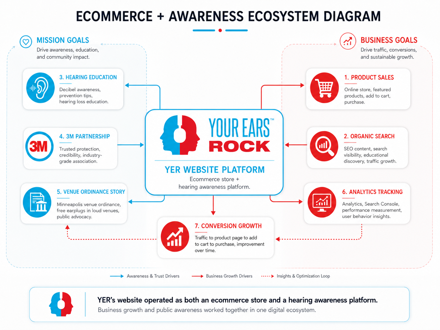 Ecommerce and awareness ecosystem
Problems
The Product Was Easy to Misunderstand
The biggest UX challenge was that the product looked similar to headphones, but it did not play music. This created a potential mismatch between what users expected and what the product actually did.
A visitor could land on the website and immediately ask:
- Is this audio equipment?
- Does it connect to my phone?
- Why would I wear this if it does not play sound?
- Is this for construction, concerts, nightlife, or fashion?
The website had to quickly clarify the value of fashionable ear protection without making the product feel overly clinical, industrial, or boring.
The core problem was not only selling the product. It was helping users understand why they should care.
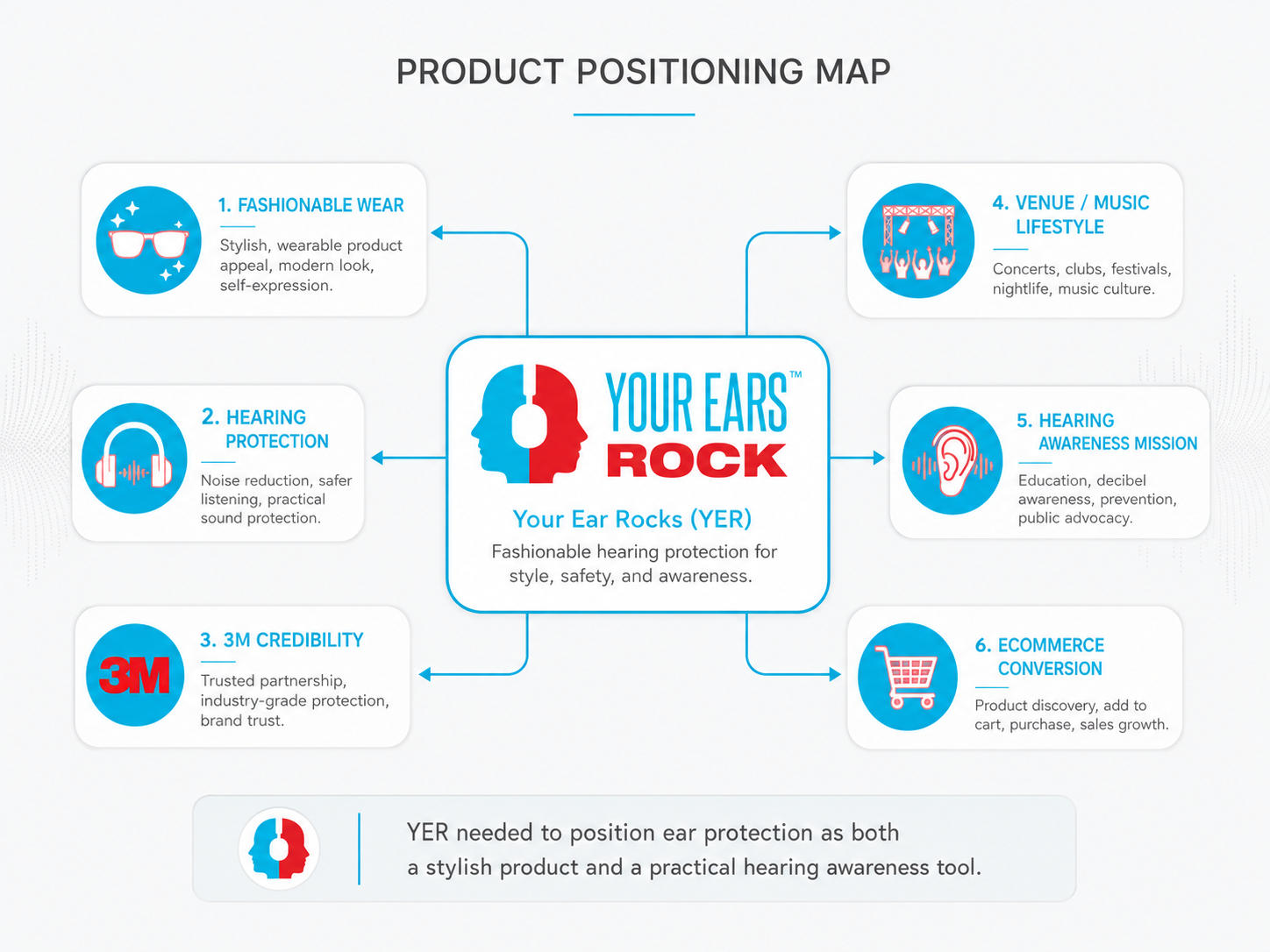 Product positioning and category clarity
Hearing Awareness Needed to Be Educational Without Feeling Like a Warning Label
Hearing safety can easily become too technical or too fear-based. If the website focused only on danger, users might disengage. If it focused only on fashion, the mission would become weak.
The challenge was to create a balance between product desire, lifestyle relevance, educational awareness, health-conscious decision-making, trust, and credibility.
The website needed to teach users about loud environments and hearing protection in a way that felt accessible and connected to their daily lives.
Instead of presenting hearing awareness as a separate educational campaign, it needed to become part of the shopping journey.
The Website Needed to Serve Multiple User Types
YER had more than one audience. Different visitors arrived with different levels of awareness and different motivations.
The Fashion-Conscious Customer cared about how the product looked and needed to see it as wearable, stylish, and socially acceptable.
The Concert, Club, or Venue Visitor was exposed to loud music environments but might not actively think about hearing protection.
The Safety-Aware Buyer may have already understood the importance of hearing protection and wanted a higher-quality solution.
The Mission-Driven Visitor cared about hearing awareness, public health, venue safety, and the broader partnership with 3M.
The website had to support all of these visitors without making the experience feel scattered.
Ecommerce and Education Had to Work Together
A standard ecommerce structure would not be enough. A product grid alone could not explain the product’s purpose. At the same time, too much education before the product could slow down the shopping path.
The main UX tension became: how do we educate users without blocking conversion?
The site needed to answer questions quickly, make the products visually desirable, and give users a clear path to purchase.
Trust Was Critical
Because the product involved hearing protection, users needed confidence. The partnership with 3M helped build credibility, but the website still needed to communicate that trust clearly.
The site had to avoid looking like a novelty fashion product with no practical value. It also had to avoid looking like a purely industrial safety website that did not appeal to everyday consumers.
Measurement Was Needed From the Start
The project also needed stronger measurement. Since the goal was to increase traffic and online sales, Analytics and Search Console were used to monitor performance over time.
The first quarter showed early organic traffic and roughly 1 to 2 conversions per month. This gave us a baseline to improve from.
Decisions
Position the Product as Fashionable Protection, Not Just Safety Gear
The website needed to make the product feel desirable first, then explain the purpose behind it.
The design direction focused on presenting ear protection as wearable, stylish, modern, useful in real-life loud environments, and connected to music, nightlife, and personal wellness.
This helped shift the perception from industrial safety equipment to something a person could actually wear.
The product imagery, page hierarchy, and messaging needed to make users feel that hearing protection could be part of a lifestyle choice.
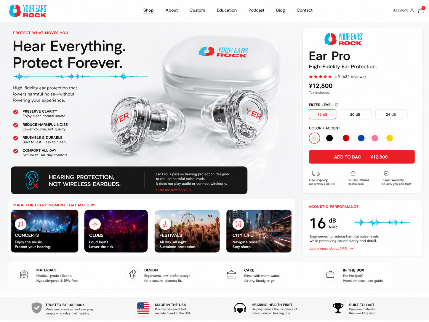
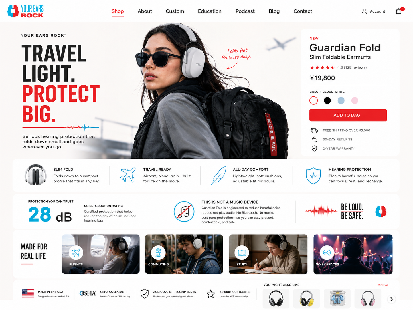
Use Product Presentation to Reduce Confusion
Because the product could be mistaken for headphones, the product pages needed to clearly explain what the item did and did not do.
The ecommerce experience had to answer core questions early:
- What is this product?
- When should I wear it?
- What kind of sound environments is it for?
- How does it help protect hearing?
- Why is this different from regular headphones?
- Why should I buy this instead of disposable earplugs?
Product pages were structured to support both visual appeal and functional clarity.
A strong product page needed large product photography, clear naming, short benefit-driven copy, use-case explanation, educational support content, trust signals connected to 3M, simple add-to-cart behavior, and related product discovery.
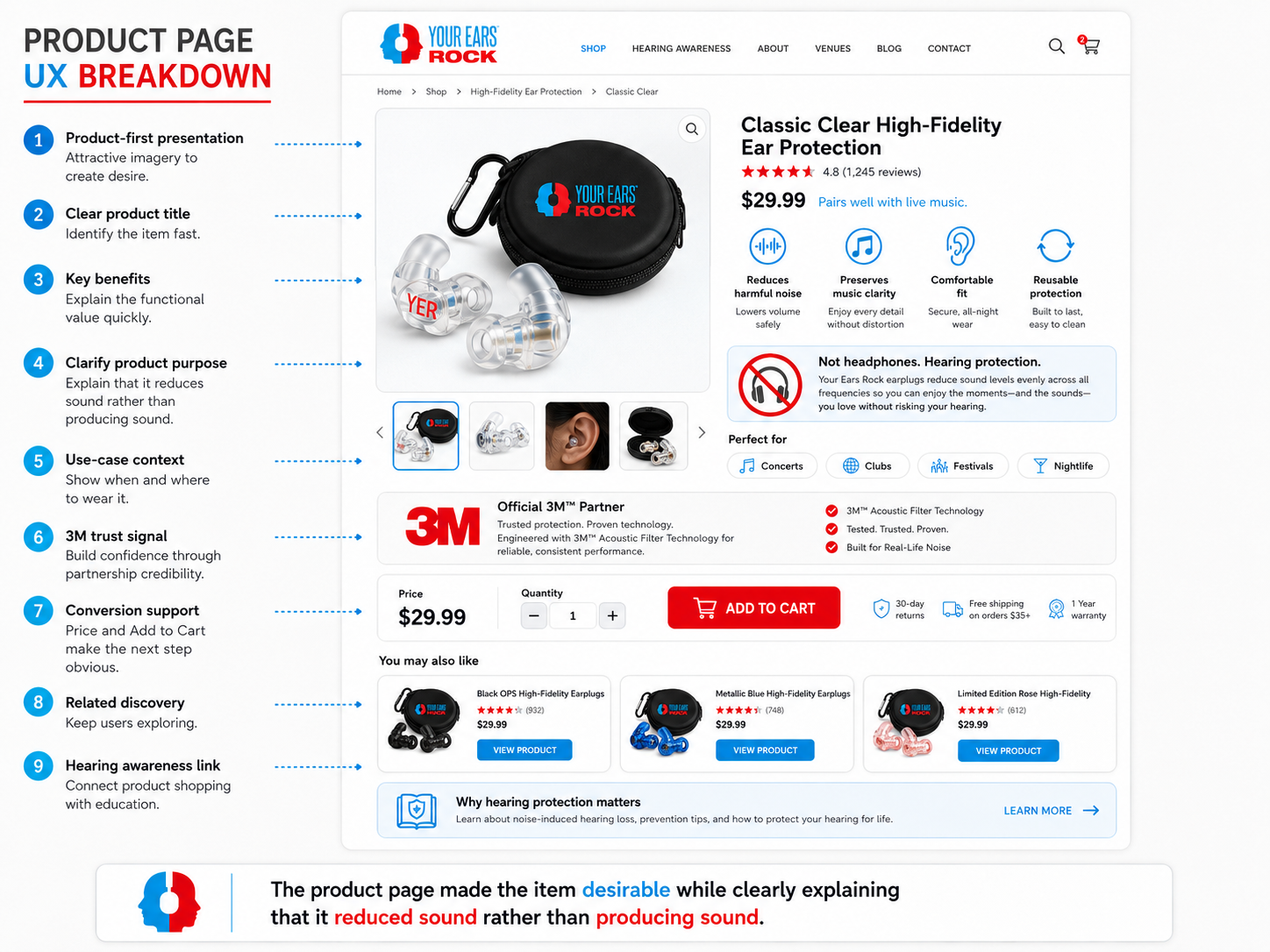 Product page UX breakdown
Make Hearing Awareness Part of the Website Architecture
Instead of treating hearing awareness as a separate blog or hidden education section, it became part of the website’s content strategy.
The site needed to guide users from interest to understanding. A visitor could enter through a product page, homepage hero, search result about ear protection, hearing awareness content, campaign page, or venue/music-related page.
The content strategy included why hearing protection matters, loud environments and everyday exposure, venue and nightlife use cases, hearing awareness education, product benefits, 3M partnership credibility, and mission-driven storytelling.
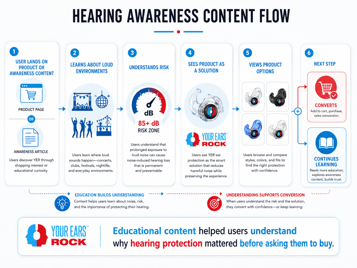 Hearing awareness flow
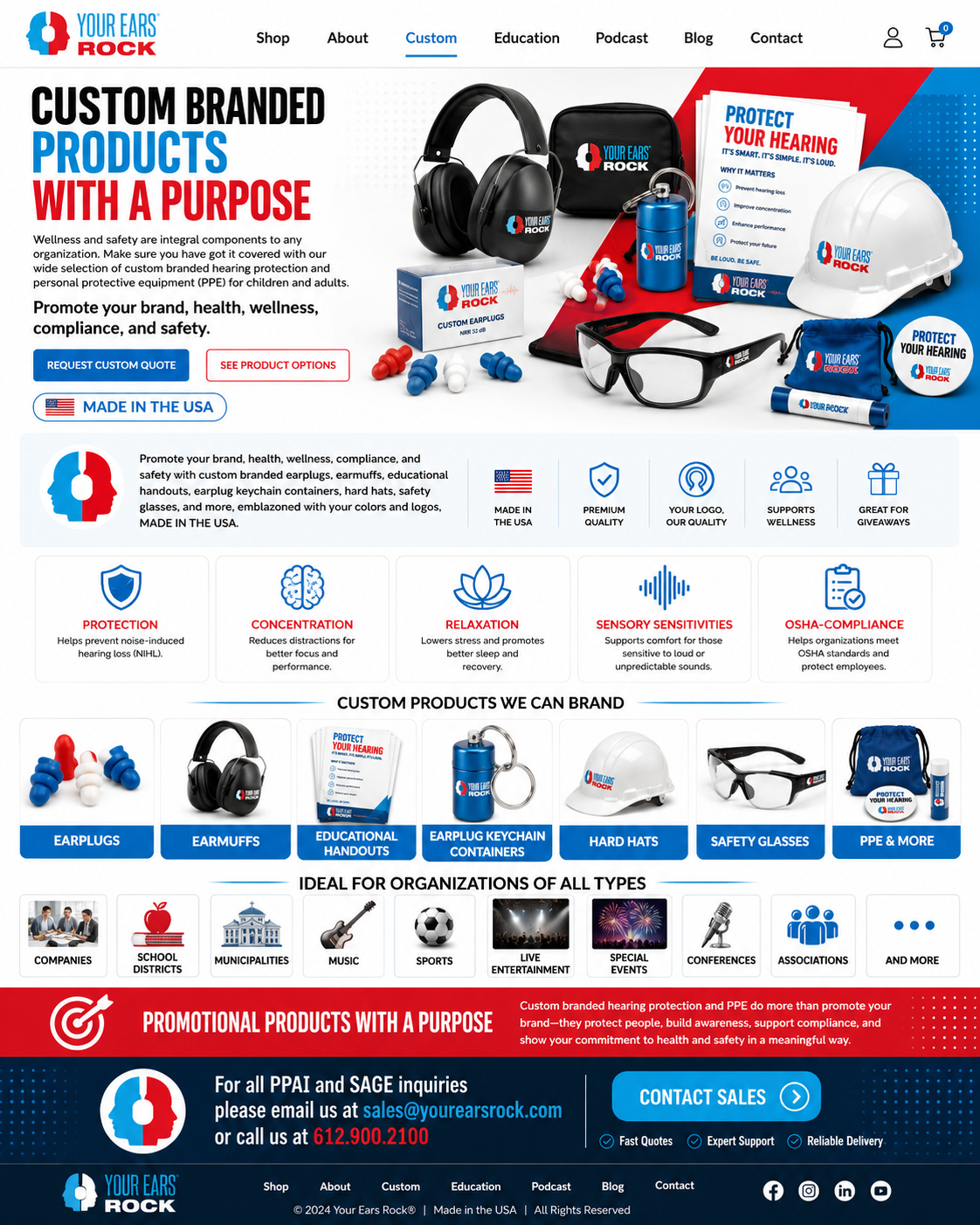
Build a Mission-Led Homepage
The homepage needed to do more than introduce products. It had to explain the brand’s reason for existing.
The homepage strategy followed a simple narrative:
- Introduce the product as fashionable hearing protection.
- Show the products visually.
- Explain why loud sound exposure matters.
- Establish trust through the 3M partnership and awareness work.
- Connect the brand to real-world environments like clubs and music venues.
- Guide users toward shopping or learning more.
This created a homepage that balanced ecommerce, education, and mission.
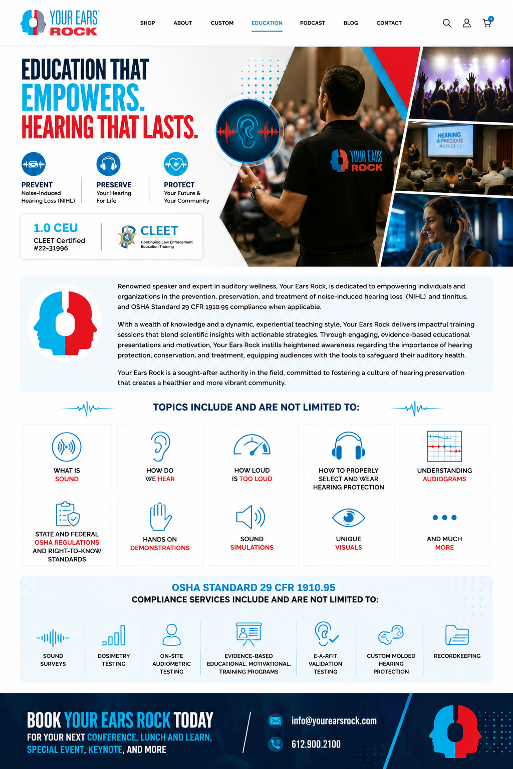
Treat SEO as a Growth Channel
Because YER had an educational mission, organic search was an important opportunity.
The website was structured to support users searching for topics around fashionable ear protection, hearing protection for concerts, ear protection for clubs, hearing awareness, loud venue safety, 3M hearing protection products, noise reduction products, earplugs, and hearing safety education.
The SEO strategy was not only about ranking product pages. It was about creating a content foundation that could attract both shoppers and awareness-driven visitors.
Use Analytics to Improve the Website Over Time
The first version of the website created the foundation. From there, performance data helped identify areas that needed polishing.
The team used analytics to watch traffic trends, search visibility, product interest, conversion behavior, underperforming areas of the site, pages that needed clearer messaging, and content opportunities.
By the fourth quarter, the website had been polished based on observed needs and performance patterns.
Result
The project helped turn YER’s website into a stronger ecommerce and awareness platform.
In the first quarter, the website was slowly generating organic traffic and roughly 1 to 2 conversions per month. This showed early signs of traction, but it also confirmed that the site needed continued refinement.
By the fourth quarter, after polishing key areas of the website, the business saw a major improvement in sales activity. The site began generating a stronger amount of daily unique visitors and approximately 40 to 50 sales per week.
The most important result was that the website became more than a basic product storefront. It became a platform that could support product sales, hearing awareness education, organic traffic growth, 3M partnership credibility, public safety messaging, mission-led ecommerce, and better customer understanding through analytics.
KPI summary:
- Organic traffic began gaining traction and continued to improve as the site structure, content, and product presentation were refined.
- Conversions started modestly at around 1 to 2 per month in Q1 and grew to approximately 40 to 50 per week by Q4.
- The website clarified that YER products were not headphones, but fashionable hearing protection products designed for loud environments.
- The website supported the broader hearing awareness mission by connecting product education, venue-related use cases, and the 3M partnership.
- Over time, the site evolved from a new ecommerce build into a more polished platform with clearer messaging, stronger product presentation, and measurable growth.
Reflections
This project taught me that ecommerce is not always about selling a product people already understand.
Sometimes the website has to create the category in the customer’s mind first.
With YER, the challenge was not only making the products look good. The challenge was explaining why someone should want stylish hearing protection in the first place.
The project reinforced several important lessons.
Education does not have to slow users down. When placed correctly, it can remove doubt and help users feel more confident about buying.
A product can be practical and still need emotional appeal. The website had to make ear protection feel wearable and desirable before asking users to purchase.
The 3M partnership gave the brand credibility, but credibility only matters if users can understand it quickly. The website needed to connect that partnership to product trust and hearing awareness.
The early website launch created a baseline. Analytics and Search Console helped identify what needed to be improved, where users were coming from, and how the site could become more effective over time.
Although I was hired as a Lead Web Developer, this project involved real UX considerations: user education, product positioning, ecommerce flow, content hierarchy, conversion strategy, SEO structure, analytics measurement, trust-building, and mission storytelling.
The project showed how UX thinking can appear inside web development work, especially when the product is unfamiliar and the website has to guide users from confusion to confidence.