Cause-Driven Ecommerce
Shop LGGK
Built a cause-driven apparel ecommerce website that balanced product discovery, hearing awareness education, donation behavior, and SEO without interrupting the shopping experience.
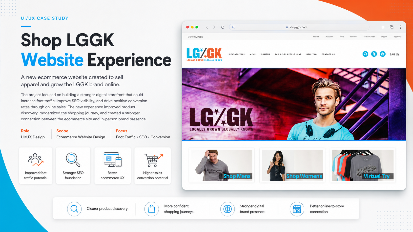
LGGK needed to sell apparel while communicating a social impact mission, but too much cause messaging risked slowing down the ecommerce journey.
The site created a functional ecommerce foundation that connected shopping, storytelling, hearing awareness, donation round-up behavior, gamified education, and organic growth strategy.
Quick Context
LGGK was an ecommerce apparel brand built around handmade-in-America clothing with a social impact mission. A portion of proceeds, at the time 20%, supported hearing awareness through the Starkey Foundation.
The goal was not only to sell apparel, but to educate visitors about the importance of protecting and caring for their hearing.
I was brought in as the Lead Web Developer to design and build a new ecommerce website. This was not a formal end-to-end UI/UX engagement, but the project involved several UX-focused decisions around ecommerce flow, donation messaging, awareness education, SEO, and user engagement.
The stakeholder had already completed much of the early brand and market foundation, including market research, brand identity, tone of voice, visual direction, design system references, and competitor analysis. My role was to translate those materials into a working digital experience that could support shopping, storytelling, donation behavior, and organic traffic growth.
The core challenge was balancing two goals:
- Sell high-quality apparel without friction.
- Educate users about hearing awareness without overwhelming the buying experience.
The website needed to feel like a fashion ecommerce brand first, while still giving the social mission enough visibility to make users understand why the brand existed.
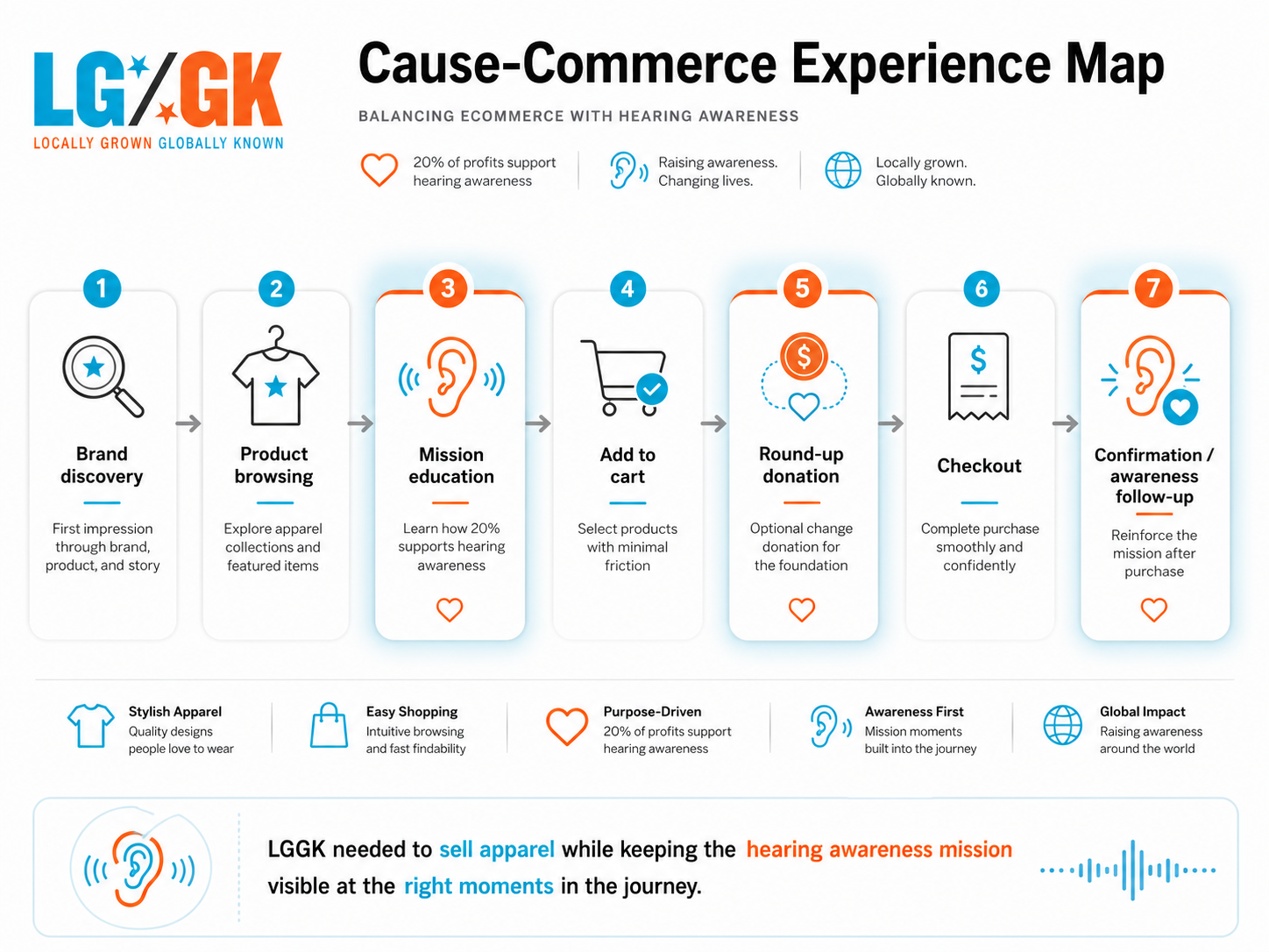 Cause-driven ecommerce strategy map
Problems
The Brand Message Needed to Be Clear, But Not Heavy
LGGK had a strong purpose: using apparel as a way to support hearing awareness. However, cause-driven ecommerce can easily become too message-heavy.
If every page over-explains the mission, users may feel like they are reading a nonprofit campaign instead of shopping a fashion brand.
The challenge was to make the hearing awareness mission visible without slowing down the shopping journey.
The site needed to answer three questions quickly:
- What does LGGK sell?
- Why does this brand exist?
- How does my purchase support the cause?
The risk was that users could either miss the mission entirely or feel distracted by it while trying to browse products.
The Donation Model Needed to Feel Natural
The ecommerce experience included the ability for buyers to round up their change toward the hearing awareness foundation. This introduced an important UX challenge.
Donation prompts can be powerful, but they can also create friction if placed poorly. A donation step that feels forced, confusing, or guilt-driven can negatively affect checkout completion.
The experience needed to make the round-up option feel simple, optional, and connected to the brand mission.
The key UX problem was: how do we invite customers to participate in the cause without making checkout feel longer or more complicated?
The Website Needed to Work as Both a Store and an Awareness Platform
LGGK was not just a product catalog. It also needed to educate users about hearing care.
That meant the site had to support two types of intent:
- Users who came to shop apparel.
- Users who were curious about the brand mission.
These two journeys had to coexist. A user interested in the apparel should not be blocked by educational content, while a user interested in the cause should have enough context to understand the impact.
Hearing Awareness Had to Be Engaging
Hearing awareness is important, but it can be difficult to make engaging in an ecommerce setting. Users typically visit apparel websites to browse products, compare styles, and complete purchases.
Educational content needed to be delivered in a lighter, more interactive way. This created an opportunity to introduce a small gamification layer.
Rather than presenting hearing awareness as long educational copy, the site could use short learning moments, interactive prompts, awareness facts, progress-style content, or quiz-like experiences to make learning feel easier and more memorable.
SEO and Organic Traffic Were Critical
The project also needed to support traffic growth. Since the brand was ecommerce-based, SEO had to be considered from the beginning.
The website needed search-friendly product pages, clear category structures, mission-driven content, brand storytelling pages, educational content around hearing awareness, and metadata/page hierarchy that could support organic visibility.
The Website Needed to Build Trust Quickly
For a newer ecommerce brand, trust is a major part of conversion.
Users needed to feel confident that the apparel was real, the mission was legitimate, and the donation model had purpose. Trust had to be built visually, structurally, and through content placement.
Decisions
Position the Website as Apparel-First, Mission-Supported
One of the most important product strategy decisions was to avoid making the website feel like a donation campaign with products attached.
Instead, the structure focused on apparel first.
The homepage and ecommerce flow were designed to introduce LGGK as a fashion brand with a strong cause behind it. This allowed the products to lead the experience while the mission added emotional value.
The intended flow was: discover the brand, browse apparel, understand the cause, purchase, and optionally round up for hearing awareness.
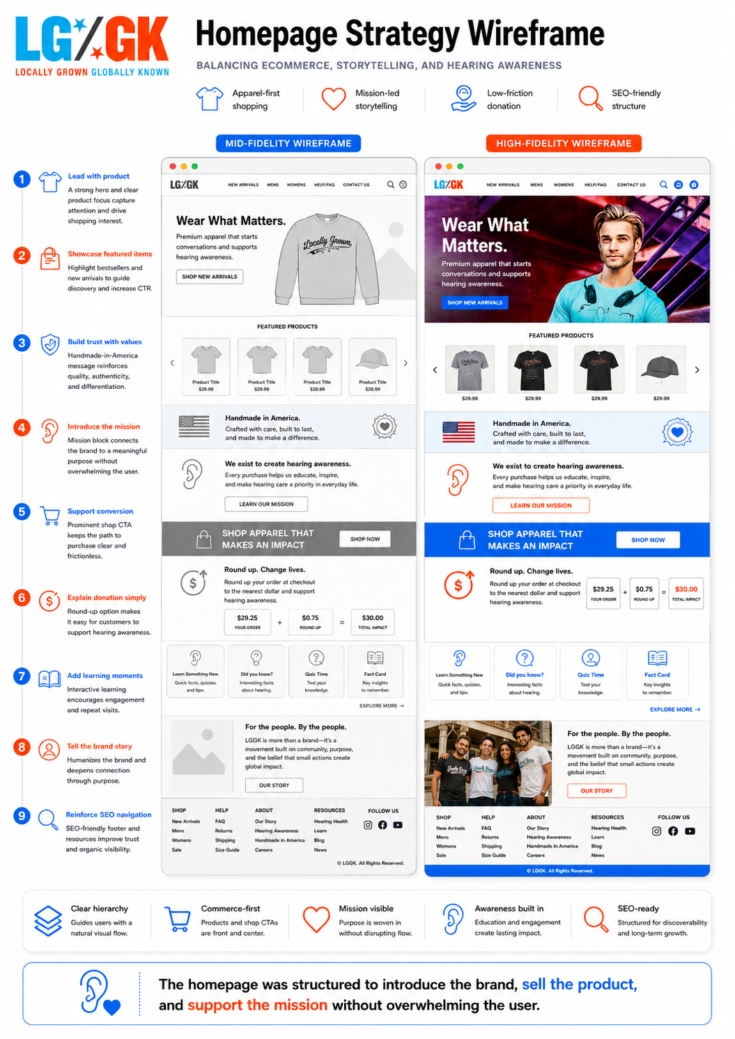 Homepage strategy frame
Use Mission Messaging at Key Decision Points
Instead of overwhelming users with hearing awareness content on every section, the mission was placed at meaningful points in the journey.
Key moments included the homepage introduction, product detail pages, About or mission page, cart and checkout donation prompt, post-purchase confirmation messaging, and gamified awareness content.
The goal was to make the mission feel like part of the brand experience rather than a separate campaign.
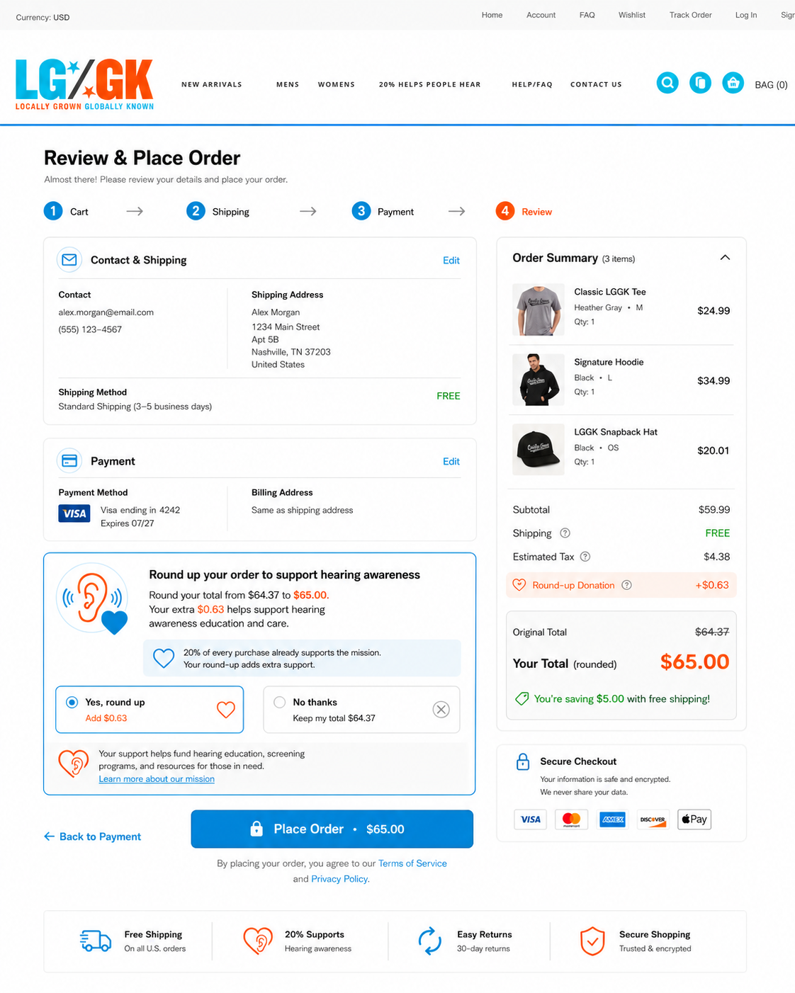
Design the Donation Round-Up as a Low-Friction Add-On
The round-up feature needed to be simple and optional. The user should immediately understand what the action does and why it matters.
The donation interaction was treated as a small checkout enhancement, not a major step in the flow.
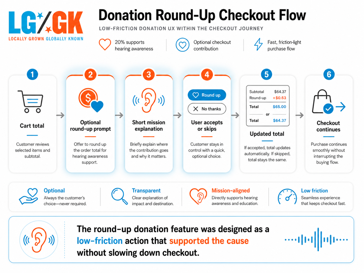
The ideal behavior was:
- User adds item to cart.
- User reviews cart total.
- User sees a clear round-up option.
- User chooses whether to round up.
- Checkout continues normally.
The copy needed to be short, direct, and transparent. A simple message like “Round up your order to support hearing awareness” keeps the action clear while connecting it back to the brand mission.
Introduce Gamification to Make Hearing Awareness Easier to Learn
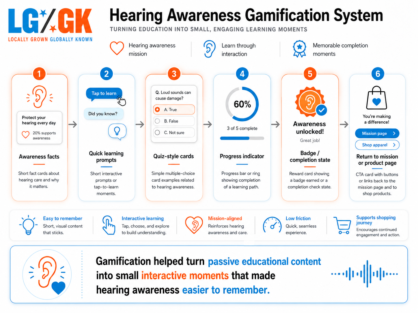
To make the educational side more engaging, I introduced a gamification system focused on hearing awareness.
The purpose was not to turn the ecommerce site into a game. The goal was to create small, lightweight learning moments that made the cause easier to understand.
Possible gamification patterns included hearing awareness facts, quick quiz-style prompts, progress-based learning, small badges or completion states, mission-related engagement modules, and educational content broken into short steps.
From a UX perspective, the gamification system supported three goals:
- Make the mission more memorable.
- Increase engagement with awareness content.
- Give users a reason to explore beyond product pages.
Build a Clear Content Architecture
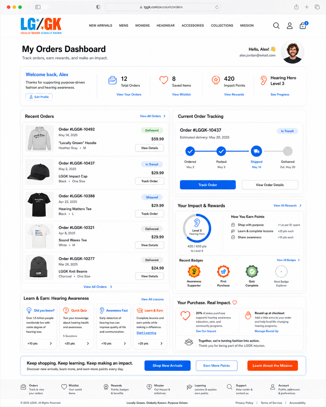
The website needed a structure that supported ecommerce, storytelling, education, and SEO.
A simplified structure may have included homepage, shop, product detail pages, brand story, hearing awareness mission, donation explanation, educational content, cart, checkout, and confirmation page.
This structure gave users multiple entry points depending on their intent. A shopper could go directly to products, a mission-driven visitor could learn about the cause, a search visitor could land on educational or product-related content, and a returning customer could move quickly into shopping.
Use SEO as a Growth Foundation
SEO was a major part of the project because the brand needed to build traffic and visibility.
The site structure supported SEO through clear page hierarchy, product-focused metadata, category page optimization, mission-based content opportunities, search-friendly copy, internal linking between products, brand story, and awareness content.
The SEO strategy had to connect two worlds: apparel and hearing awareness.
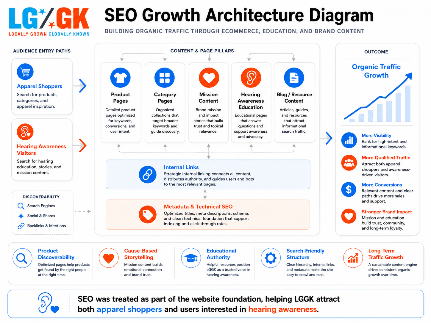 SEO growth architecture
Keep the Visual System Clean and Fashion-Oriented
Because the stakeholder had already developed brand identity and visual direction, the website needed to respect that foundation.
The design approach focused on strong product imagery, clean ecommerce layouts, clear calls to action, minimal friction between pages, brand storytelling sections, and donation/mission highlights that did not compete with product browsing.
The mission was treated as a supporting layer within the visual system, not a separate visual language.
Support Conversion Without Overloading the User
Every major page needed to help users move forward.
For the ecommerce experience, that meant clear product names, strong product images, simple product detail layout, visible pricing, easy add-to-cart behavior, clear checkout path, optional donation prompt, and trust-building mission content.
For the awareness experience, that meant short educational content, interactive learning moments, clear explanation of the foundation connection, and an easy return path back to shopping.
The UX goal was to prevent the site from splitting into two competing experiences. Shopping and awareness needed to support each other.
Result
The final website direction created a stronger digital foundation for LGGK as a cause-driven ecommerce brand.
The project delivered a website that could sell apparel online, communicate the brand mission, support hearing awareness education, allow customers to round up their change for the foundation, build organic traffic through SEO, create a more engaging experience through gamified awareness content, and balance product discovery with purpose-driven storytelling.
Because this was not a full UX research engagement, exact UX testing metrics were not the primary deliverable. However, the project was built around measurable business goals and future KPI tracking.
Target KPI areas included organic traffic growth, product discovery, conversion rate, donation participation, mission engagement, and brand trust.
The project transformed LGGK from a brand concept into a functional ecommerce experience that supported both product sales and social impact. By keeping the shopping flow clean, placing mission content at key decision points, and introducing a lightweight awareness gamification layer, the website helped connect commerce, education, and donation behavior in one experience.
The result was not just a website that sold apparel. It was a digital platform for a brand trying to make hearing awareness part of the customer journey.
Reflections
This project taught me how important it is to balance message and momentum in ecommerce design.
When a brand has a strong cause, it can be tempting to explain everything upfront. But users still need a clear path to browse, evaluate, and purchase. The mission should strengthen the buying experience, not interrupt it.
The biggest lesson was that UX can exist inside a development-led project. Even though I was hired as the Lead Web Developer rather than a full UI/UX designer, many of the decisions were still UX decisions:
- Where should the mission appear?
- How much education is too much?
- When should the donation prompt appear?
- How do we make awareness engaging?
- How do we keep checkout simple?
- How do we support SEO and conversion at the same time?
I also learned that gamification can be useful when it serves the message. In this case, the goal was not to add novelty. The goal was to make hearing awareness easier to understand and more engaging for users who originally came to shop.
In future projects, I would want to expand this type of work with deeper usability testing, donation prompt A/B testing, heatmap analysis, checkout funnel review, and post-launch KPI tracking. This would help validate which awareness messages increased engagement and which donation placements created the least friction.
Overall, LGGK was an early example of how ecommerce, social impact, education, and interaction design can work together when the experience is carefully structured.