Portfolio Website
Khodr Cherri
Designed a clean WordPress photography portfolio that made Khodr Cherri's collections easier to browse, appreciate, and inquire about.
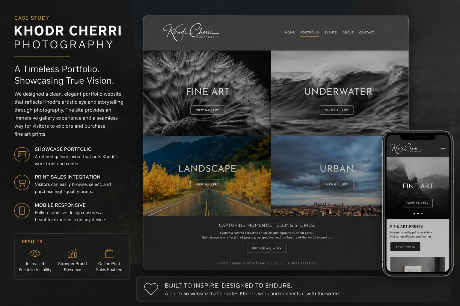
The photographer needed a central online portfolio that felt professional, organized multiple photography collections clearly, and let the work lead without interface clutter.
Created a polished, image-led WordPress portfolio with clear collection entry points, restrained styling, and a simple path from visual discovery to inquiry.
Project Context
Khodr Photography needed a new online portfolio that could act as a central home for the photographer’s work. The goal was not to build a complex product or full ecommerce system, but to create a polished visual experience where visitors could quickly understand the photographer’s style, browse collections, and make purchase or contact inquiries.
The website was built in WordPress using a predefined color palette and a simple gallery-first structure. The finished design focused on large photographic visuals, minimal navigation, and clear collection entry points such as Fine Art, Underwater, Landscape, and Urban.
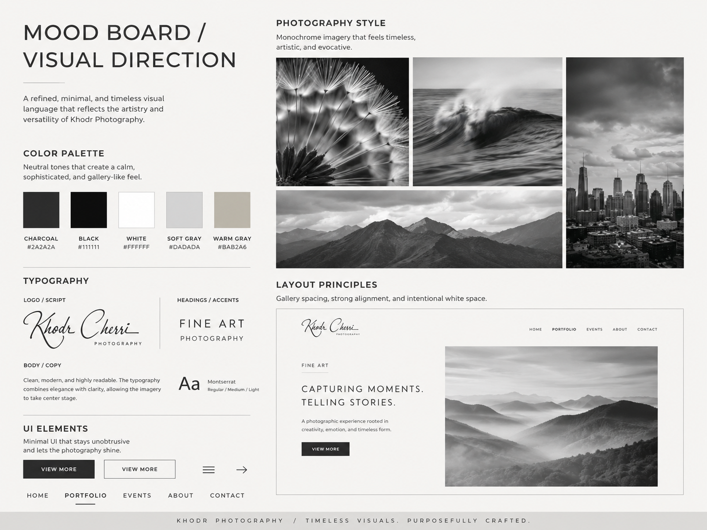 Mood board and visual direction
Quick Context
Khodr Photography needed a digital portfolio that felt clean, artistic, and easy to explore. The previous need was straightforward: create a professional website that could showcase multiple photography collections without distracting from the work itself.
The site had to serve three main purposes:
- Present the photographer’s work in a visually refined way.
- Organize the portfolio into clear categories.
- Give visitors a simple path to learn more, view collections, and inquire about purchasing prints or photography services.
Because the project was a new design rather than a full UX product, the UX work focused on content organization, visual hierarchy, browsing behavior, and inquiry clarity.
Problems
The Photographer Needed a Stronger Portfolio Presence
The main challenge was that the photographer’s work needed a central destination that felt more professional than scattered image sharing or informal presentation.
Photography is highly visual, so the website needed to create an immediate emotional impression. The site could not feel overly corporate or text-heavy. It needed to let the images carry the experience.
The problem was not just “make a website.” The real challenge was: how do we create a simple portfolio experience that makes the photography feel valuable, curated, and easy to explore?
Visitors Needed Fast Visual Orientation
A photography website visitor usually wants to answer a few questions quickly:
- What kind of work does this photographer create?
- Does the style match what I am looking for?
- Where can I view more?
- How do I contact the photographer or ask about buying work?
Without a clear structure, users could easily feel lost inside a gallery. The website needed to separate the work into recognizable categories so people could browse based on their interest.
That led to the need for clear portfolio pathways: Fine Art, Underwater, Landscape, Urban, events or additional photography categories, and contact or inquiry.
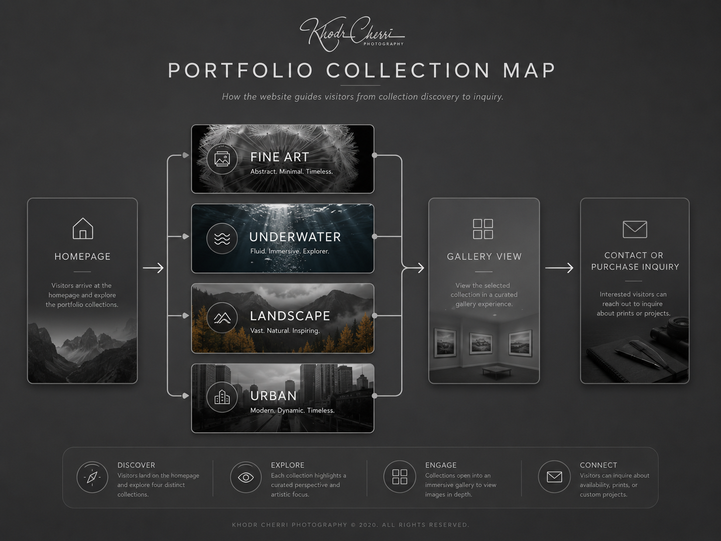 Portfolio browsing flow
The Design Needed to Support the Art, Not Compete With It
A common issue with portfolio websites is that the interface can become too decorative. For Khodr Photography, the interface needed to be quiet and controlled.
The photography already had strong contrast, movement, texture, and mood. The website’s visual system had to support that by using minimal navigation, neutral background areas, large image tiles, simple typography, strong spacing, and clear “View More” actions.
This allowed the photography to remain the hero of the experience.
Purchase Interest Needed a Simple Path
Although the site was not built as a full ecommerce platform, it still needed to support inquiries from visitors interested in the photographer’s work.
The UX problem was that users may enjoy a photo but not know what to do next. The site needed a simple bridge between viewing the work and taking action.
That meant the contact experience had to be accessible without forcing the website into a full shopping-cart model.
Decisions
Use a Gallery-First Homepage
The homepage was designed around large visual category blocks instead of long introductory copy. This made the experience immediate and image-led.
The finished homepage used a simple grid structure where each photography category became a visual entry point. This helped visitors understand the range of work without needing to read a lot first.
Photography visitors often make quick emotional decisions. A strong visual grid allows users to self-select the category that interests them most.
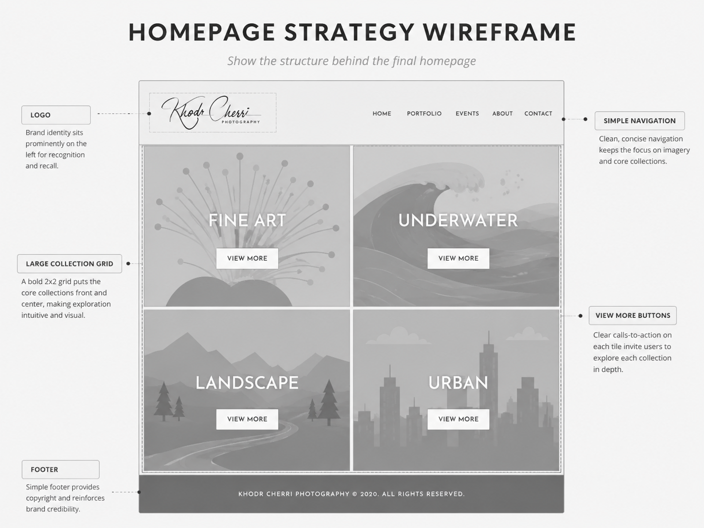 Gallery-first structure and wireframe overview
Keep the Navigation Minimal
The top navigation was kept simple with core links such as Home, Portfolio, Events, About, and Contact.
This avoided overwhelming the visitor and kept the website focused on discovery.
A portfolio site does not need a complicated menu. The fewer decisions a user has to make, the easier it is for them to start browsing the work.
Organize the Work Into Clear Collections
The portfolio was structured around photography types rather than forcing all images into one large gallery.
The collection categories gave the website a stronger editorial feeling. Each section acted like a curated room inside a gallery.
The structure became: homepage, portfolio category, collection gallery, then image detail or inquiry path.
This made the site easier to scan and more professional in presentation.
Use Restrained Visual Styling
The color palette and layout were kept intentionally understated. The goal was to avoid visual noise and allow the photography to create the mood.
The design used neutral gray and black tones, large image crops, white call-to-action buttons, clean typography, and spacious visual rhythm.
This created a gallery-like atmosphere while still feeling accessible on the web.
Build on WordPress for Easier Content Management
WordPress was chosen because the photographer needed a practical way to manage the site after launch. Since portfolio websites often need new images, updated collections, and event information, WordPress offered a flexible foundation.
The site needed to look polished for visitors, but it also needed to be manageable for the owner. A website that is hard to update quickly becomes outdated.
Keep the Inquiry Path Simple
The site was not designed as a full print ecommerce system, so the contact path had to do the job of connecting visitor interest to a real conversation.
The inquiry experience needed to be easy to find after browsing a collection, clear enough for visitors interested in prints or services, and restrained enough that it did not interrupt gallery browsing.
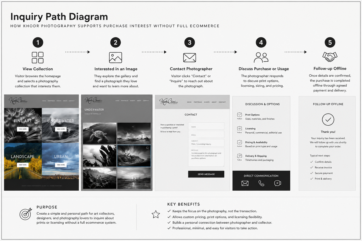 Inquiry path from viewing to contact
Result
The final website created a more professional and organized portfolio presence for Khodr Photography.
Instead of presenting the work as a flat gallery, the new site gave the photographer a curated digital home where visitors could explore different visual styles and collections.
Key outcomes included:
- Created a polished WordPress portfolio website.
- Organized photography into clear collection categories.
- Improved the first impression of the photographer’s brand.
- Made the work easier to browse through large visual entry points.
- Created a simple path for contact and purchase inquiries.
- Established a flexible website foundation for future updates.
Because this was a simple design project and exact analytics may not be available, the project can be framed with directional success metrics rather than fabricated numbers.
Recommended KPIs would include portfolio views, contact form inquiries, time spent viewing galleries, clicks from homepage categories, returning visitors, image collection engagement, purchase inquiry volume, and event page visits if events were promoted.
The result was a clean, image-led website that gave Khodr Photography a more professional online presence and made it easier for visitors to move from visual discovery to inquiry.
Reflections
This project reinforced how important restraint is in portfolio design. The website did not need heavy interaction, complex features, or excessive copy. It needed to create the right frame for the work.
The biggest lesson was that a photography website succeeds when the interface disappears enough for the images to take center stage.
For future improvements, the site could evolve with a dedicated print inquiry flow, individual image detail pages, SEO-friendly collection descriptions, featured project stories, analytics tracking for gallery engagement, a lightweight print sales or request-to-purchase system, and stronger mobile gallery optimization.
This project was a reminder that even a simple website can involve meaningful UX decisions. The work was not about building a complex app. It was about understanding how people browse visual work and designing a calm, clear experience around that behavior.