Product Design
GachaBytes
Designed a retro game collection toolkit for Japanese game collectors built around one clear product promise: Track, Hunt, Play, and Remember.
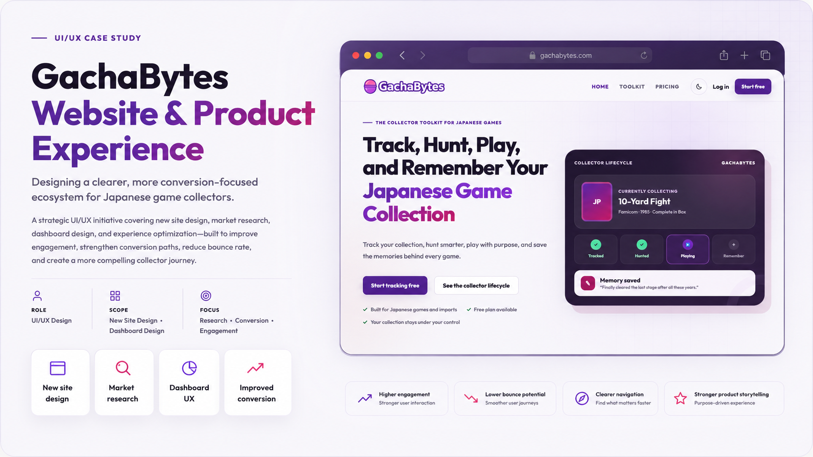
Collectors already use spreadsheets, notes, marketplace lists, photos, and memory to manage their collections, so GachaBytes needed a sharper reason to exist than simply being another game-tracking tool.
Created a focused product direction, UX foundation, brand system, and measurement plan for a toolkit that connects collection management, wishlist planning, backlog motivation, and memory keeping.
Product Idea
GachaBytes is a retro game collection toolkit built around a simple promise:
Track, Hunt, Play, and Remember Your Japanese Game Collection.
The goal was to create a useful digital companion for collectors of Japanese retro games. Instead of being only a database, spreadsheet, or wishlist tool, GachaBytes was designed as a collection hub where users could manage what they own, plan what they want, organize what they are playing, and preserve the memories behind their gaming journey.
Quick Context
Japanese retro game collecting can be exciting, but it can also become messy quickly. Collectors often manage their games across spreadsheets, notes apps, marketplace watchlists, photos, backlog lists, and memory-based tracking.
The more the collection grows, the harder it becomes to answer simple questions:
- What games do I already own?
- What am I looking for next?
- What have I actually played?
- What memories do I want to keep from this collection?
GachaBytes started as a personal product concept, but the challenge was bigger than simply designing another cataloging tool. The real goal was to understand what value a dedicated retro game toolkit could provide in a space where collectors already have scattered systems and habits.
The product needed to feel useful, focused, and emotionally connected to the collector experience. It had to support practical collection management while also celebrating the personal side of collecting Japanese games.
The final product direction became a toolkit built around four core user needs:
- Track owned games and collection details.
- Hunt for wishlist games and future collection goals.
- Play through the backlog with more intention.
- Remember gaming sessions, reviews, screenshots, and collection milestones.
Because this is a new project, the launch also included a measurement foundation using GTM, Google Analytics, Search Console, and Microsoft Clarity. This allows the product to begin tracking traffic, user behavior, conversion patterns, engagement, and future product improvement opportunities.
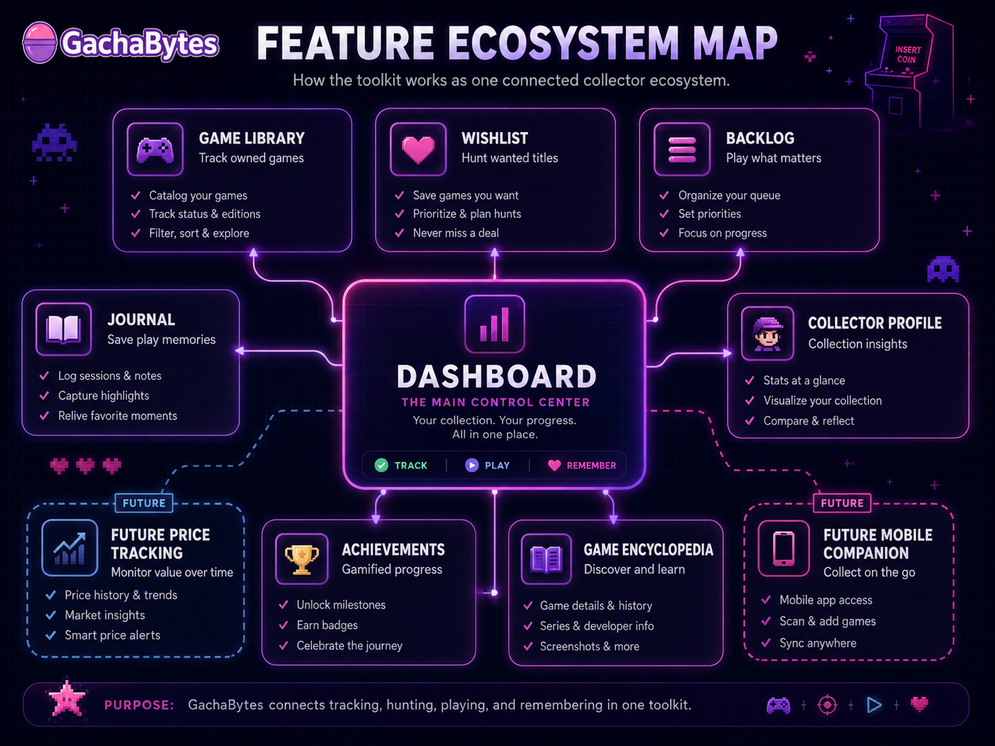 Feature ecosystem around Track, Hunt, Play, and Remember
Problems
The Main UX Problem
The biggest problem was not only how to design the toolkit. The bigger challenge was defining why the toolkit should exist.
Retro game collectors already have many ways to track their collection. Some use spreadsheets. Some rely on marketplace watchlists. Some track games in notes apps. Others simply remember what they own. A new product needed to provide value beyond being another list.
The key UX question became:
How can GachaBytes become useful enough for collectors to return to it regularly?
To answer that, the project focused on understanding the behaviors behind collecting.
Collectors are not only managing inventory. They are making decisions, comparing priorities, building wishlists, tracking value, playing through backlogs, and attaching memories to games. A strong product needed to support both the practical and emotional sides of collecting.
Collection Tracking Is Often Fragmented
Many collectors do not have one reliable place where their collection lives. A single game might be tracked in a spreadsheet, photographed on a shelf, saved in a marketplace watchlist, or remembered mentally.
This creates several problems:
- Users may forget what they already own.
- Wishlist priorities become scattered.
- Backlog goals are separated from the collection itself.
- Collection value and condition are hard to review.
- Memories and play history are rarely connected to the game library.
For Japanese retro game collectors, the problem becomes even more complex because users may care about region, platform, box condition, language barrier, rarity, release year, and collector notes.
The product needed to simplify this complexity without overwhelming users.
Existing Tools Often Focus on Only One Part of the Journey
Competitor analysis helped reveal that many tools solve one piece of the problem, but not the entire collector journey.
Some products focus on cataloging. Some focus on pricing. Some focus on marketplaces. Some focus on backlog tracking. Some focus on game discovery. Some focus on journaling or reviews.
The opportunity for GachaBytes was to connect these behaviors into one collector-centered experience.
The product did not need to replace every tool immediately. Instead, it needed to create a more meaningful ecosystem where the user could move naturally from owning, to wanting, to playing, to remembering.
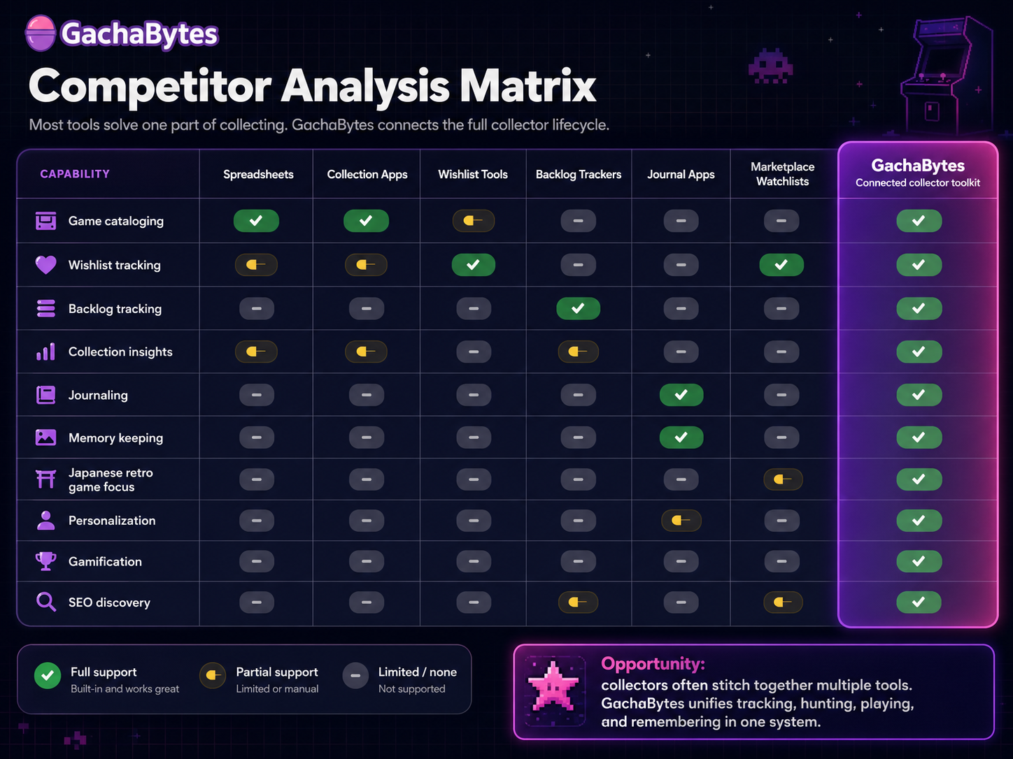 Competitor analysis and product opportunity
The Product Needed a Clear Value Proposition
A major challenge was communication. If the landing page only said “track your games,” the product could feel too generic. The value had to be sharper and more memorable.
The positioning needed to answer:
- Why should a retro game collector sign up?
- Why would they keep using this tool?
- What makes it different from a spreadsheet?
- How does it support the emotional side of collecting?
- How can premium features feel valuable later?
This led to the product framing:
Track, Hunt, Play, and Remember.
This phrase became more than marketing copy. It became the product architecture.
Feature Depth Could Create Overwhelm
The product had many possible features:
- Game library.
- Wishlist.
- Backlog.
- Journal.
- Collection analytics.
- User preferences.
- Achievements.
- Game encyclopedia.
- Memory book.
- Future price tracking.
- Future mobile companion experience.
The challenge was deciding how to make the product feel powerful without making it feel bloated.
The UX needed to guide users through a clear starting point. A first-time user should not feel like they need to understand the whole system immediately. They should be able to complete one meaningful action first, such as adding a game, setting preferences, or starting a wishlist.
A New Product Needs Measurable Learning
Because GachaBytes is new, there were no long-term performance metrics yet. That made analytics planning an important part of the design process.
The product needed to collect enough behavioral data to answer questions after launch:
- Are users signing up?
- Are they completing onboarding?
- Are they adding games?
- Are they using wishlist and backlog features?
- Are they returning to the dashboard?
- Are they discovering journal features?
- Where are users dropping off?
- Which parts of the landing page help conversion?
- Which features could support paid upgrades later?
GTM, Analytics, Search Console, and Microsoft Clarity were added so future design decisions could be based on real behavior instead of assumptions.
Decisions
Build the Product Around Four User Jobs
The most important product decision was to organize GachaBytes around four clear user jobs.
Track: users need a reliable place to manage owned games, platforms, genres, regions, and collection details. This became the foundation of the product because the collection library is the starting point for everything else.
Hunt: collectors are always looking for the next game. Wishlist functionality gives users a place to organize what they want, prioritize future pickups, and keep their collecting goals visible.
Play: a collection is not only something to own. Users also need a way to decide what to play next, what they are currently playing, and what they have completed. This led to backlog-focused thinking and play status organization.
Remember: retro gaming is emotional. Users may remember where they bought a game, when they played it, what made it special, or why it matters to their collection. The journal and memory book direction gave the product a more personal reason to exist.
This four-part structure helped transform GachaBytes from a database into a collection companion.
Create Personas Based on Collector Motivation
The personas were created around behavior and motivation, not only demographics.
Persona 1: The Organized Collector. This user owns enough games that memory is no longer reliable. They want a clean way to track their collection, avoid duplicates, and understand what they own. Their main needs are structure, search, filters, platform organization, and collection visibility.
Persona 2: The Wishlist Hunter. This user is always looking for the next pickup. They compare games, save targets, and think about rarity, condition, and future collecting goals. Their main needs are wishlist tracking, collection gaps, priority planning, and eventually price or availability signals.
Persona 3: The Backlog Player. This user owns many games but has not played enough of them. They want motivation to start, continue, and finish games from their collection. Their main needs are play status, backlog boards, progress tracking, and gentle reminders.
Persona 4: The Memory Keeper. This user sees games as personal history. They care about memories, screenshots, play sessions, reviews, and the story behind their collection. Their main needs are journaling, screenshots, reviews, session notes, and yearly summaries.
These personas helped guide feature priority and messaging. The product could not only serve collectors who buy games. It also needed to serve users who play and remember them.
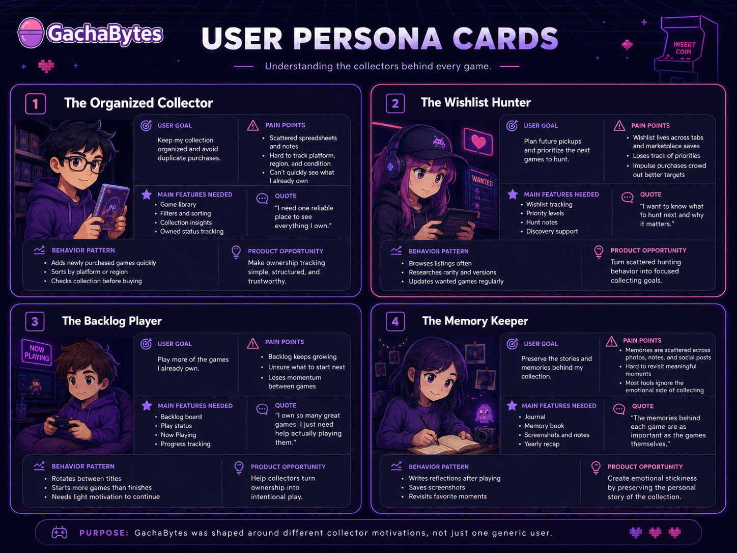 Collector motivation personas
Design a Toolkit Ecosystem Instead of a Single Feature
The product was structured as an ecosystem of connected tools.
The dashboard became the home base. From there, users could access their collection, wishlist, backlog, journal, analytics, and future features.
This decision helped make the toolkit feel expandable while still keeping the main product story simple.
The ecosystem included:
- Game library.
- Wishlist.
- Backlog.
- Journal and memory book.
- Collector profile analytics.
- User onboarding preferences.
- Achievements and gamification concepts.
- Game encyclopedia for discovery and SEO.
- Future price tracking ideas.
- Future mobile companion possibilities.
The goal was not to launch every advanced idea at once. The goal was to create a strong product foundation that could grow over time.
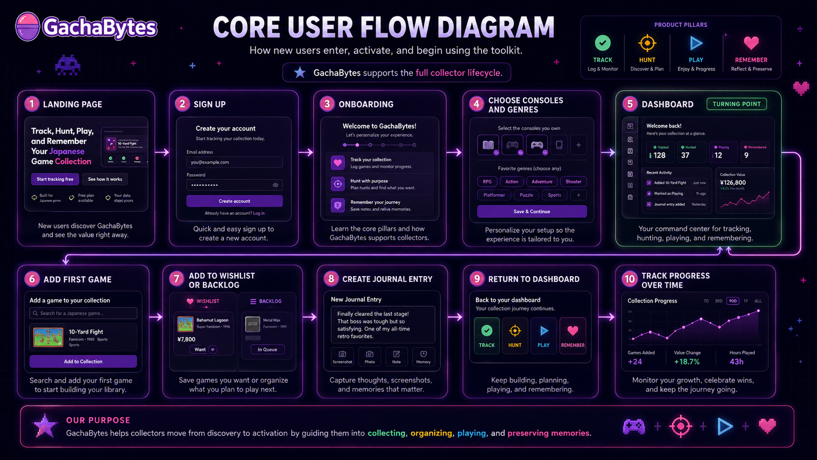 Core user flow through the toolkit
Use Onboarding to Personalize the Experience
A key UX decision was to make onboarding about the user’s taste.
Instead of dropping users into an empty dashboard, the onboarding flow helps capture preferred consoles, favorite genres, and genres to avoid. This creates a more personal first impression and gives the product a way to shape future recommendations, prompts, and collection insights.
The onboarding flow was designed to feel lightweight and collector-friendly.
It asks:
- Which platforms do you collect or care about?
- Which genres do you enjoy?
- Which genres are you less interested in?
- Do you want to start adding games now?
This also supports future personalization across the toolkit.
Use Low-Fidelity Wireframes to Reduce Complexity Early
Low-fidelity wireframes helped test layout ideas before investing in polished UI.
The focus was on structure first:
- How should the dashboard introduce the toolkit?
- Where should the collection summary live?
- How should users move between library, wishlist, backlog, and journal?
- What should appear on a game card?
- How much information is too much?
- What should the first user action be?
This stage helped simplify the experience and avoid overwhelming users with too many features at once.
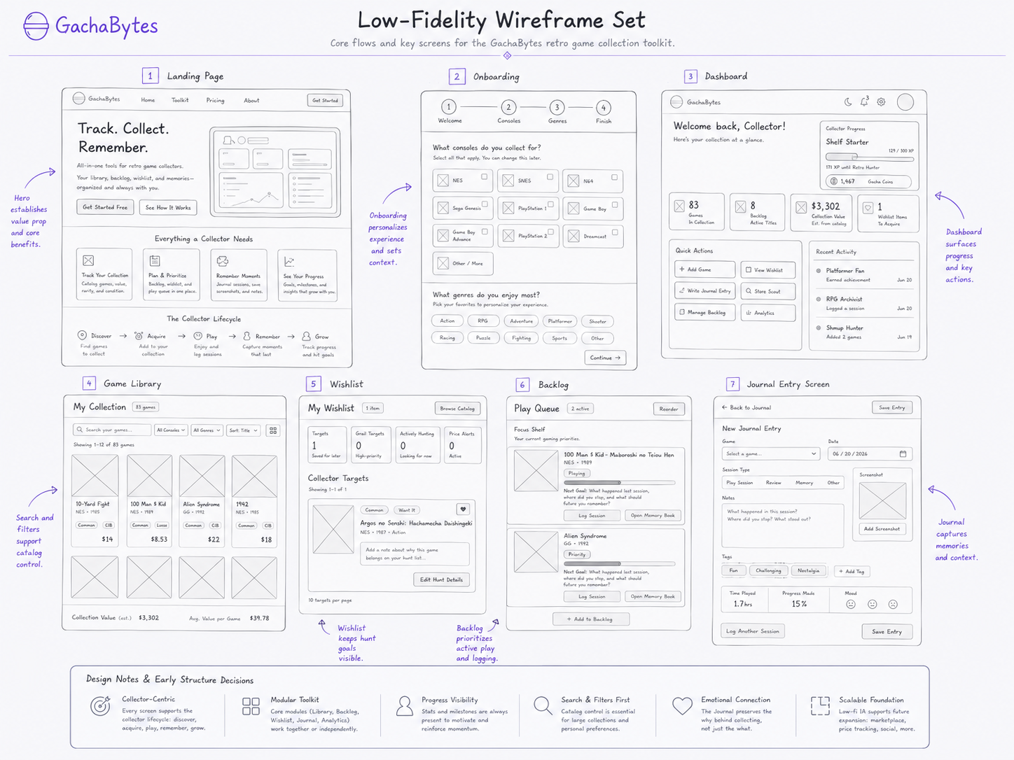 Low-fidelity structure exploration
Balance Nostalgia and Usability in the Interface
The visual direction needed to feel connected to retro gaming without becoming a novelty interface.
The design system leaned into a modern arcade-inspired style:
- Dark UI foundation.
- Bright accent colors.
- Card-based layouts.
- Game-inspired labels and badges.
- Dashboard-style information hierarchy.
- Clear CTA buttons.
- Readable typography.
- Rounded cards and modular components.
- Feature sections that could scale across marketing and app pages.
The goal was to make the product feel playful, but still usable as a serious toolkit.
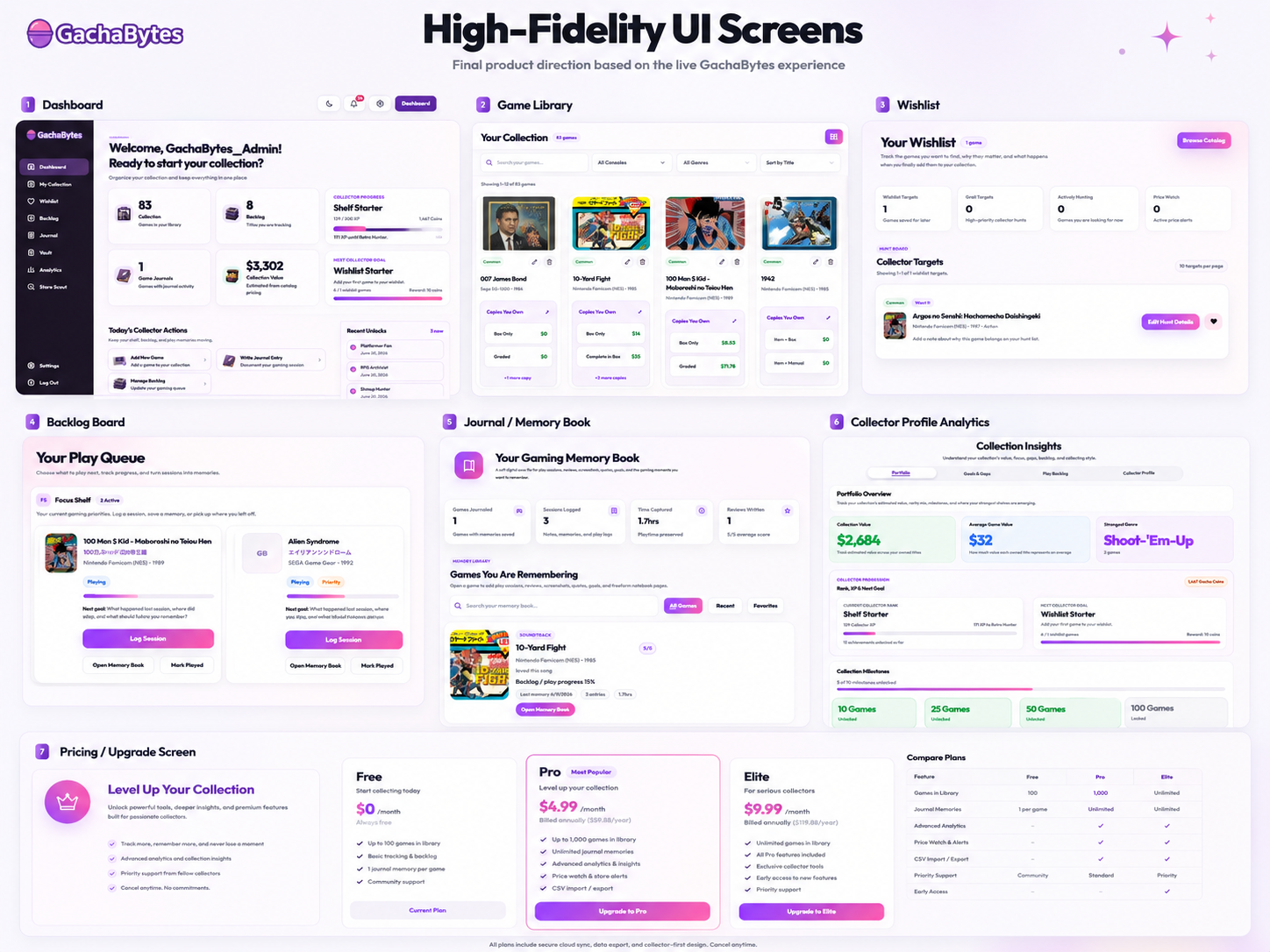 High-fidelity interface direction
Connect Branding to Product Behavior
The GachaBytes brand needed to feel fun, niche, and collectible. The name suggests retro collecting, discovery, and surprise, while the product experience grounds that playful identity in useful tools.
Branding was used to support the core product promise:
- Collectors can build a library.
- Collectors can hunt for games.
- Collectors can work through their backlog.
- Collectors can preserve memories.
This helped keep the brand from becoming only decorative. The brand became part of the product story.
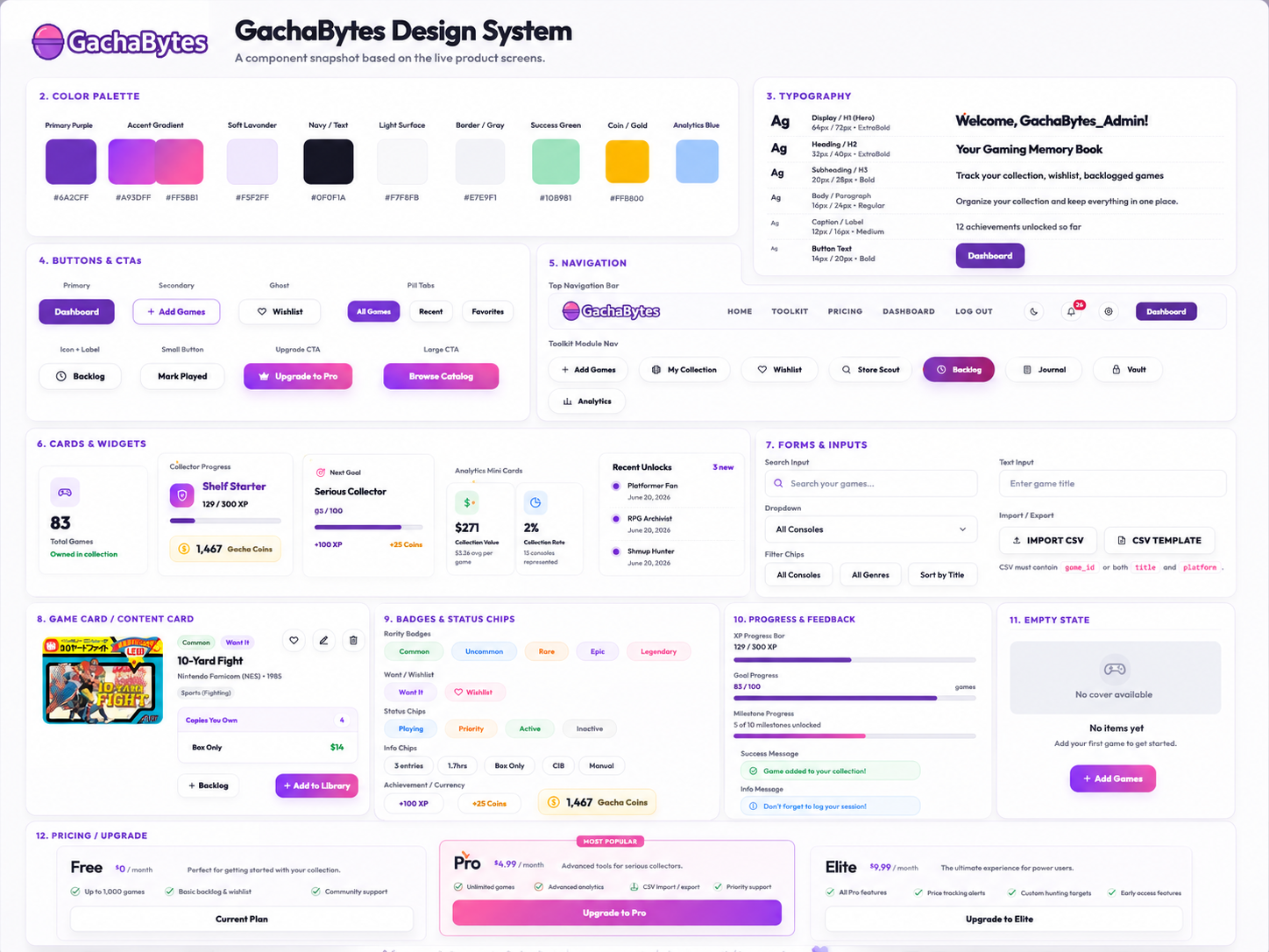 Arcade-inspired design system
Add Analytics From the Beginning
Because the project is new, measurement was planned early instead of added later.
The analytics stack included:
- Google Tag Manager.
- Google Analytics.
- Google Search Console.
- Microsoft Clarity.
The goal was to track product and marketing performance across multiple layers:
- Traffic growth.
- Search visibility.
- Landing page engagement.
- Account creation.
- Onboarding completion.
- Feature adoption.
- Dashboard interactions.
- Wishlist activity.
- Backlog activity.
- Journal usage.
- Conversion to higher paid plans.
- Bounce rate and engagement rate.
- Heatmaps, scroll behavior, and friction points.
This makes the project easier to improve after launch because future decisions can be tied to user behavior.
Result
The result was a clearer product direction and a stronger toolkit foundation for GachaBytes.
Instead of positioning the product as a simple game tracker, the experience evolved into a broader retro collection companion. The final direction connected practical collection management with emotional memory keeping.
The product now has a clearer story:
GachaBytes helps Japanese retro game collectors track what they own, hunt what they want, play what they have, and remember why the collection matters.
The work produced a full UX foundation, including:
- Competitor analysis.
- User personas.
- Product positioning.
- Feature ecosystem mapping.
- User flows.
- Low-fidelity wireframes.
- High-fidelity interface design.
- Brand direction.
- Design system.
- Analytics and KPI planning.
- Conversion-focused landing page structure.
- Dashboard and toolkit experience direction.
Because this is a new product, exact KPI improvements are still being measured. Instead of claiming performance numbers too early, the project established a clear measurement framework.
The main KPIs being tracked include:
- Website traffic growth.
- Organic search visibility.
- Bounce rate reduction.
- Account creation.
- Onboarding completion.
- Game library additions.
- Wishlist additions.
- Backlog interactions.
- Journal entries.
- Returning user activity.
- Conversion to higher paid accounts.
- Feature engagement.
- User friction through Microsoft Clarity.
The biggest result so far is that the product moved from a broad idea into a structured, measurable, and scalable experience.
The design now gives users a reason to return beyond simple tracking. It supports collection management, discovery, play motivation, and memory preservation.
Reflections
This project reinforced that a strong product is not built only from features. It is built from a clear understanding of user motivation.
At first, GachaBytes could have become just another collection tracker. Through research, competitor analysis, personas, and design iteration, the product became more focused. The strongest insight was that retro game collectors are not only managing items. They are building a personal archive.
A collection is practical, emotional, nostalgic, and ongoing.
That insight changed the product direction. The toolkit needed to help users manage their games, but it also needed to help them enjoy and remember their collection.
The project also showed the importance of creating a measurement plan early. Since GachaBytes is new, analytics will be essential for deciding what to improve next. GTM, Analytics, Search Console, and Microsoft Clarity give the project a foundation for learning from real users.
Future improvements could include:
- Improving onboarding based on completion data.
- Making the first game-add experience faster.
- Creating stronger feature discovery inside the dashboard.
- Expanding wishlist and price tracking features.
- Improving backlog motivation loops.
- Deepening the journal and memory book experience.
- Testing premium feature interest.
- Building a mobile companion experience.
- Using SEO content to grow organic discovery.
- Using Clarity recordings to identify friction points.
The biggest lesson was that niche products need a sharp reason to exist. GachaBytes works best when it does not try to be everything to everyone. It is strongest when it focuses on a specific collector journey:
- Track the collection.
- Hunt for what is next.
- Play what you own.
- Remember the journey.