Wholesale UX
Defiance USA
Turned Defiance USA's static corporate website into a clearer sales and wholesale support hub connected to ecommerce, B2B ordering, and inventory operations.
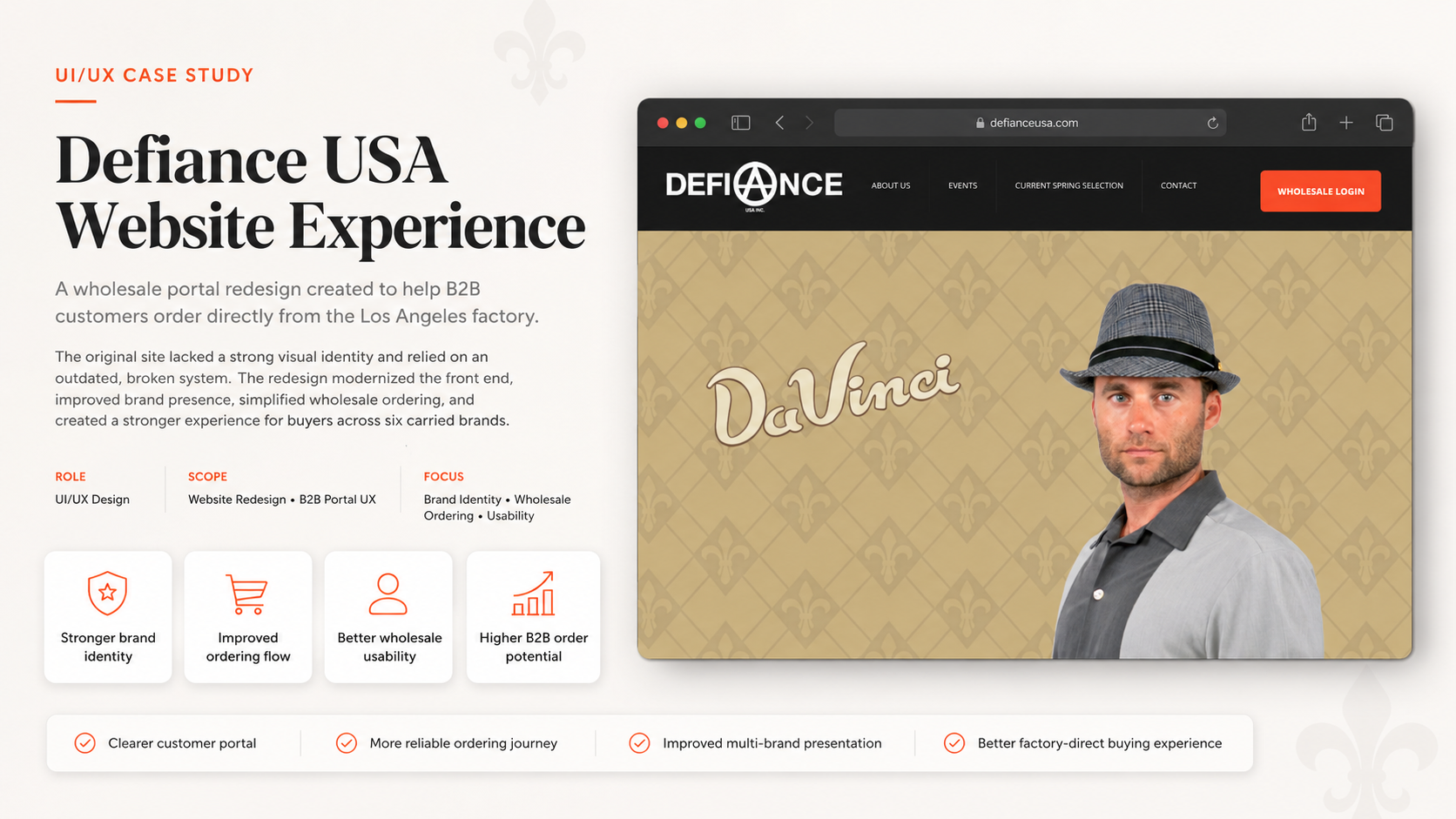
The website mostly acted as a narrow gateway to a wholesale portal, while retail shoppers, business visitors, wholesale buyers, and internal teams all needed clearer paths.
The redesign clarified wholesale and retail journeys, strengthened the connection to Global Rebels ecommerce, and improved the B2B ordering and inventory-support flow.
Quick Context
Defiance USA was the parent corporate website for Global Rebels, an apparel manufacturing company led by fashion designer Christopher Wicks. While Global Rebels operated as the ecommerce brand, Defiance USA functioned more as the business-facing umbrella site.
When I joined the project as a web designer, the Defiance USA website had a very narrow purpose: direct wholesale customers to the company’s B2B ordering portal. The site was not designed to support the broader business ecosystem, guide different customer types, or connect the corporate brand with the ecommerce side of the company.
The project started as a website management and redesign task, but it quickly expanded into a larger flow improvement project. The goal became to make Defiance USA more useful as a corporate entry point while also improving the broken wholesale ordering process behind the scenes.
My role included managing the corporate website, improving the website flow, connecting users to the ecommerce experience, and helping repair the B2B ordering system so it could work more effectively with the warehouse inventory process.
This was not a full UX case study with complete research cycles, usability labs, or formal testing. It was a practical redesign project with UX thinking applied to navigation, user flow, business logic, ecommerce connection, and internal ordering operations.
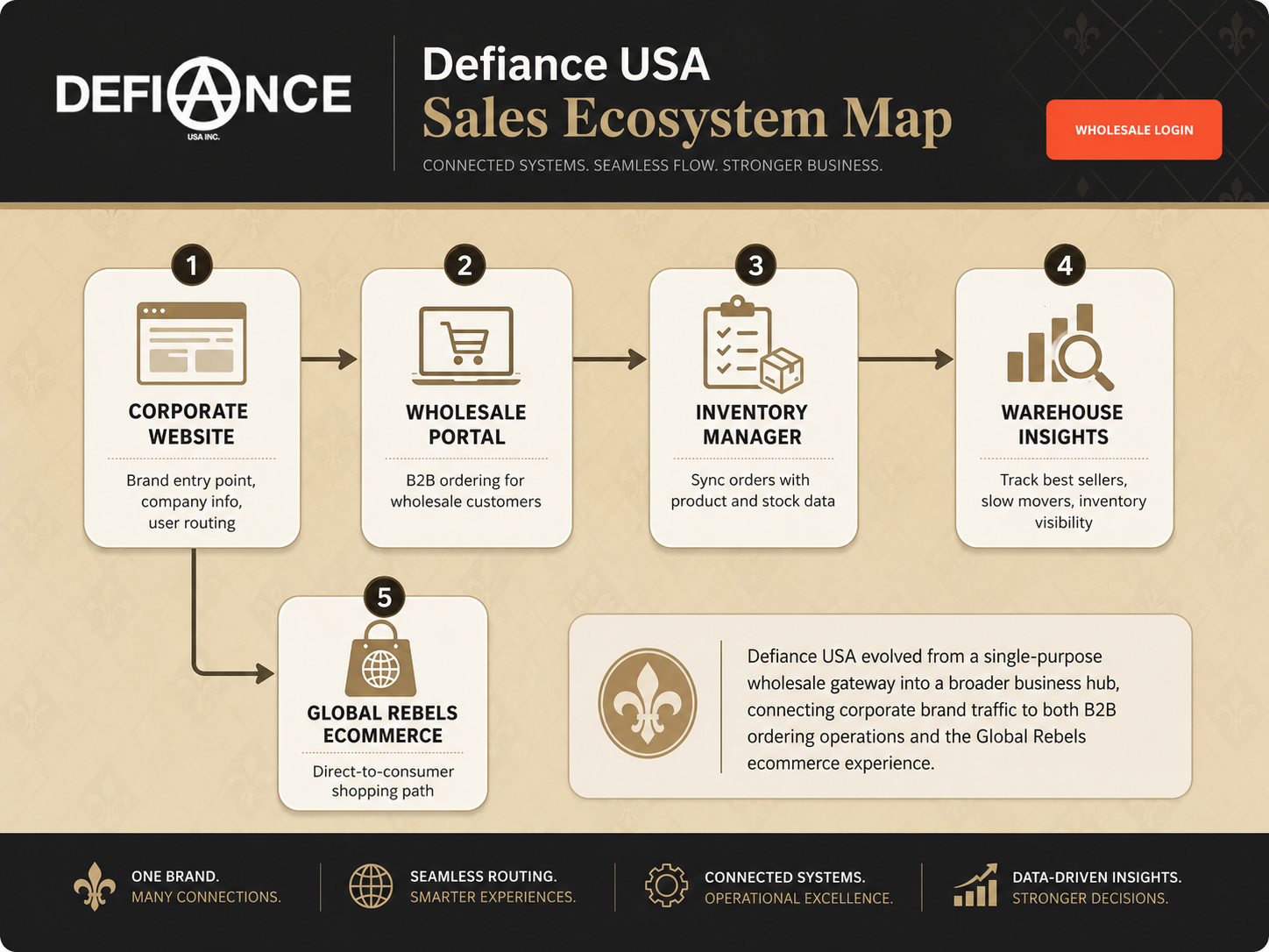 Sales ecosystem and routing map
Problems
The Website Only Served One Narrow Purpose
The original Defiance USA website mainly acted as a gateway to the wholesale B2B portal. While that served one business need, it ignored other important opportunities.
A visitor landing on the website had very little context. If they were not already a wholesale customer, the site did not clearly explain the company, connect them to Global Rebels, or guide them toward any meaningful next step.
The website behaved more like a holding page than a corporate platform.
Key User Groups Had Different Needs
The website needed to support more than one type of visitor:
- Wholesale buyers needed a clear path to the B2B ordering portal.
- Retail customers needed a way to discover and shop Global Rebels products through the ecommerce website.
- Business partners or brand visitors needed to understand who Defiance USA was and how it connected to the larger apparel business.
- Internal staff and warehouse teams needed the ordering system to better reflect what was happening with inventory and sales.
The old experience did not separate these user needs clearly. Everyone was pushed toward the same basic path, even when their intent was different.
The Corporate and Ecommerce Experiences Were Disconnected
Because Defiance USA was the umbrella site and Global Rebels was the ecommerce brand, there was an opportunity to create a stronger relationship between the two.
Instead, the two experiences felt disconnected. A user visiting Defiance USA would not necessarily understand that there was a customer-facing ecommerce destination attached to the company.
This created a missed opportunity. The corporate website could have acted as a bridge between the company’s wholesale operations and its direct-to-consumer ecommerce presence.
The B2B Ordering System Was Broken
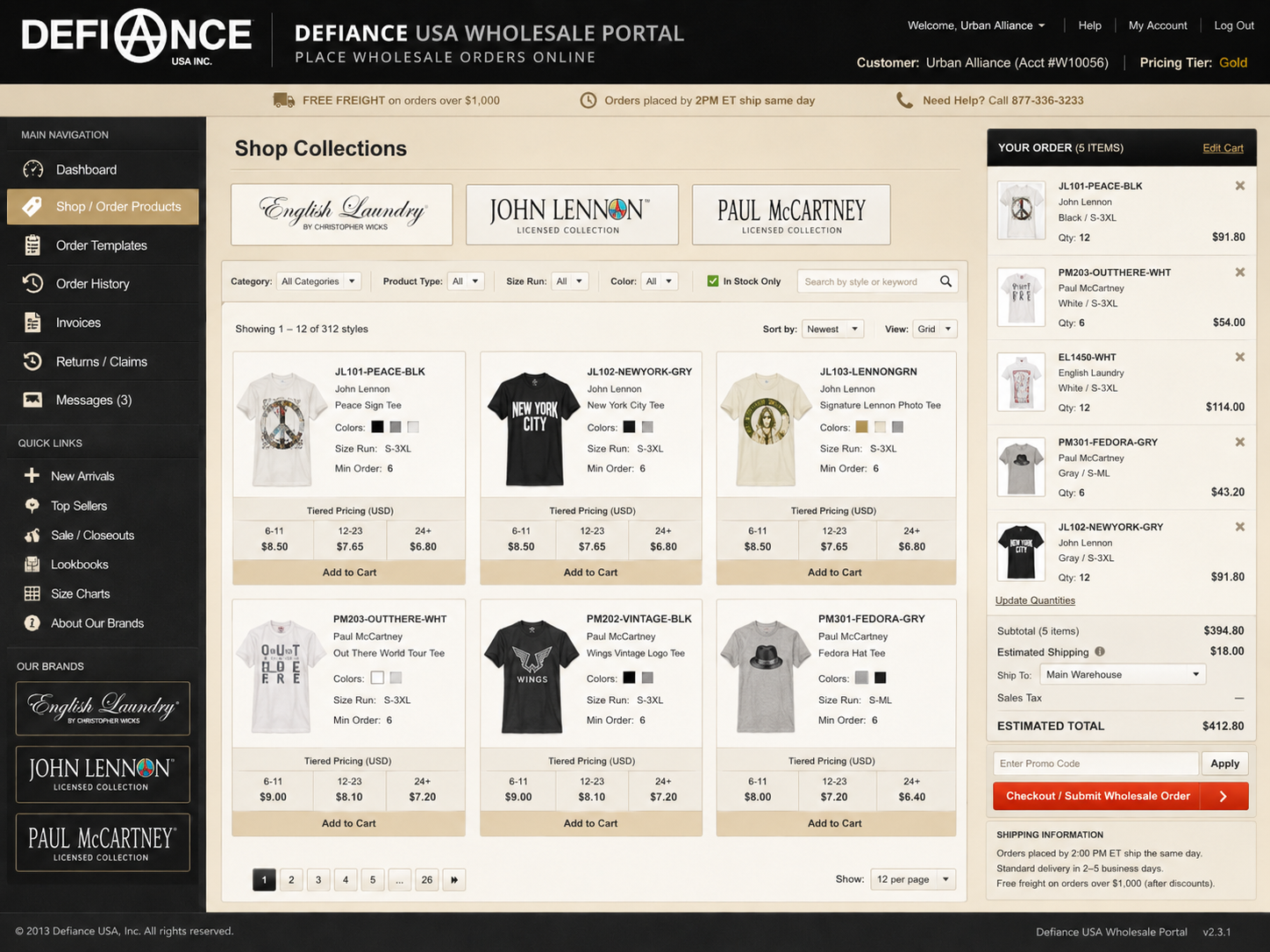
The larger issue was not only the website itself. The B2B ordering platform had problems that affected wholesale customers and internal staff.
If wholesale customers had trouble placing orders, the portal no longer served its main purpose. A broken ordering flow created friction for buyers, increased manual support needs, and made the business less efficient.
For a company managing apparel inventory, this was especially important. Size, style, color, stock levels, and product availability all needed to be accurate enough for wholesale buyers to place informed orders.
Inventory Visibility Was Not Strong Enough
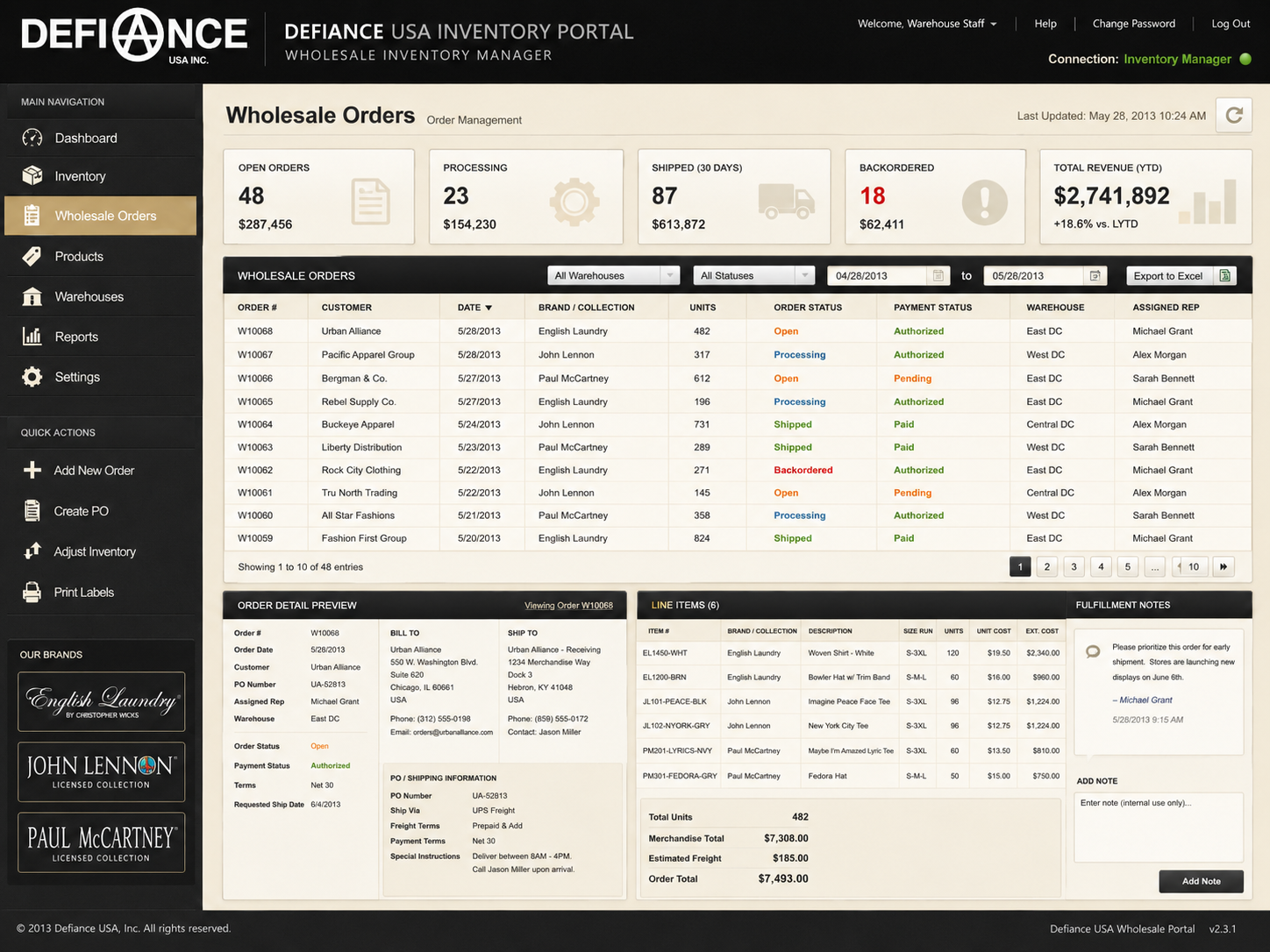
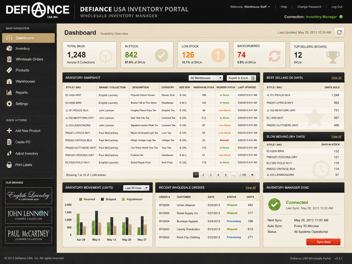
The B2B platform also needed to connect more effectively with the wholesale inventory manager used by the warehouse manager.
Without a stronger connection between the ordering system and inventory management, the company had less visibility into what products were moving, which items were underperforming, and what inventory needed attention.
This created a business intelligence problem. The company was selling products, but the system was not making it easy enough to understand sales behavior at the wholesale level.
The Business Needed Better Flow, Not Just Better Visuals
The redesign was not only about making the site look better. The bigger issue was flow.
The website needed to answer:
- Where should wholesale buyers go?
- Where should retail shoppers go?
- How does Defiance USA connect to Global Rebels?
- How should product interest lead into ecommerce?
- How should wholesale ordering connect to inventory?
- How can the website reduce confusion instead of adding another layer of friction?
The main UX challenge was to turn a basic corporate website into a clearer business routing system.
Decisions
Reposition the Website as a Corporate Sales Hub
The first major decision was to expand the role of the Defiance USA website.
Instead of treating it as a single-purpose B2B portal link, the site could become a corporate sales hub that served multiple paths:
- Wholesale ordering.
- Ecommerce discovery.
- Brand and company context.
- Business and product navigation.
This gave the website a stronger purpose. It was no longer just a doorway to one portal. It became the starting point for different business actions.
Separate Wholesale and Retail Intent
A key UX decision was to clarify the difference between wholesale customers and retail shoppers.
Wholesale customers needed fast access to the B2B portal. These users likely already knew the company and wanted to order efficiently.
Retail shoppers needed a different path. They needed to be routed toward Global Rebels, where they could browse and purchase products directly.
By separating these paths, the site could reduce confusion and make each user journey more intentional.
The improved structure could be understood as:
- Corporate visitor lands on Defiance USA.
- User identifies intent.
- Wholesale buyer goes to B2B portal.
- Retail shopper goes to Global Rebels ecommerce.
- Business visitor learns about the company.
- Internal ordering activity connects to inventory management.
Strengthen the Connection to Global Rebels
Since Defiance USA served as the umbrella brand, the website needed to do a better job of connecting users to the Global Rebels ecommerce experience.
This meant adding clearer pathways from corporate information to product discovery. The goal was to allow the corporate website to support ecommerce traffic instead of only serving wholesale customers.
This decision helped Defiance USA become part of a larger sales ecosystem.
Repair the B2B Ordering Flow
The B2B platform needed to work reliably because it supported wholesale customers and internal operations.
The decision was to focus on the functional ordering journey rather than treating the issue as only a front-end design problem.
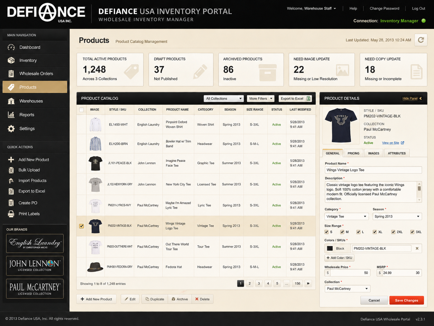
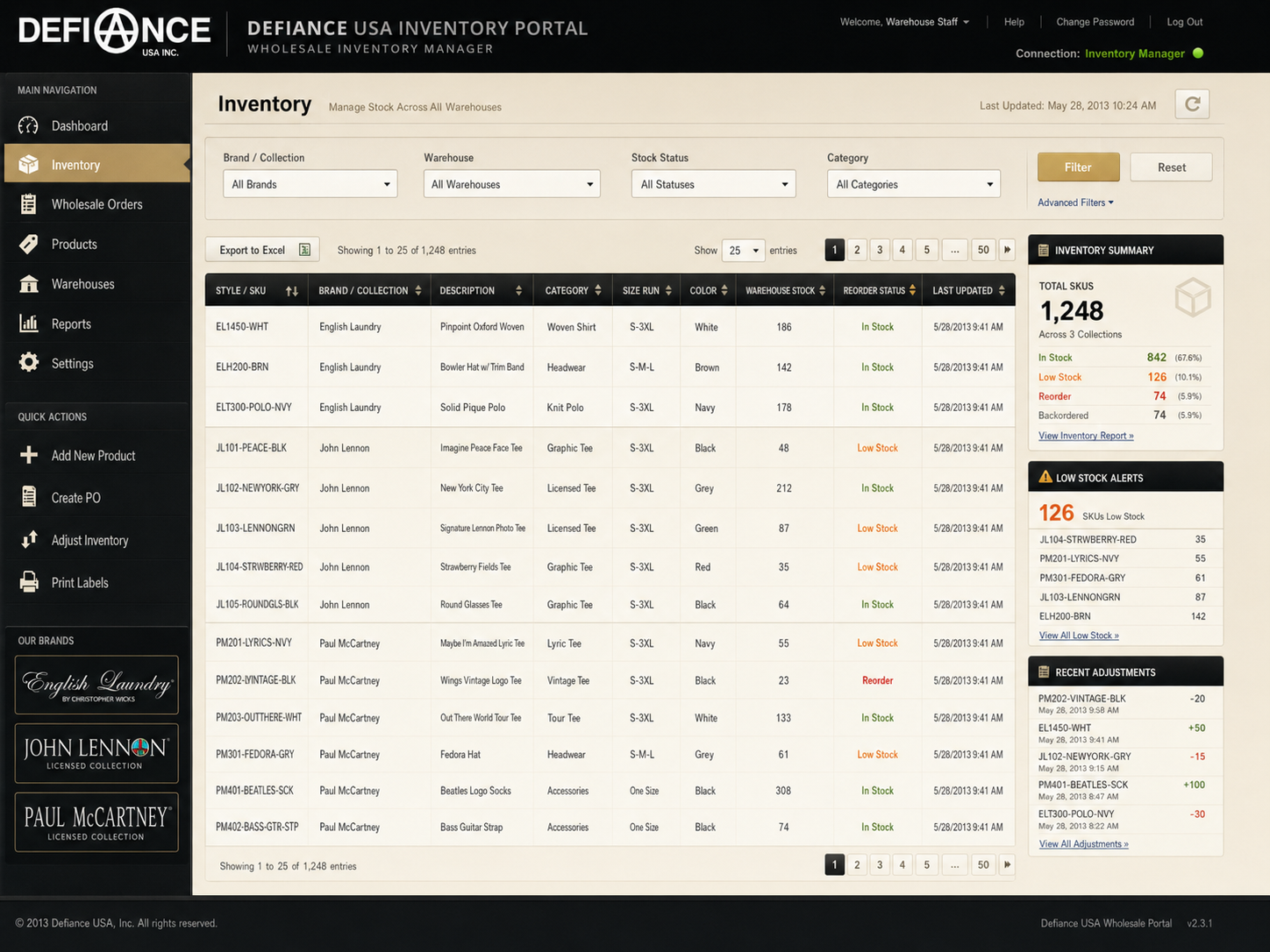
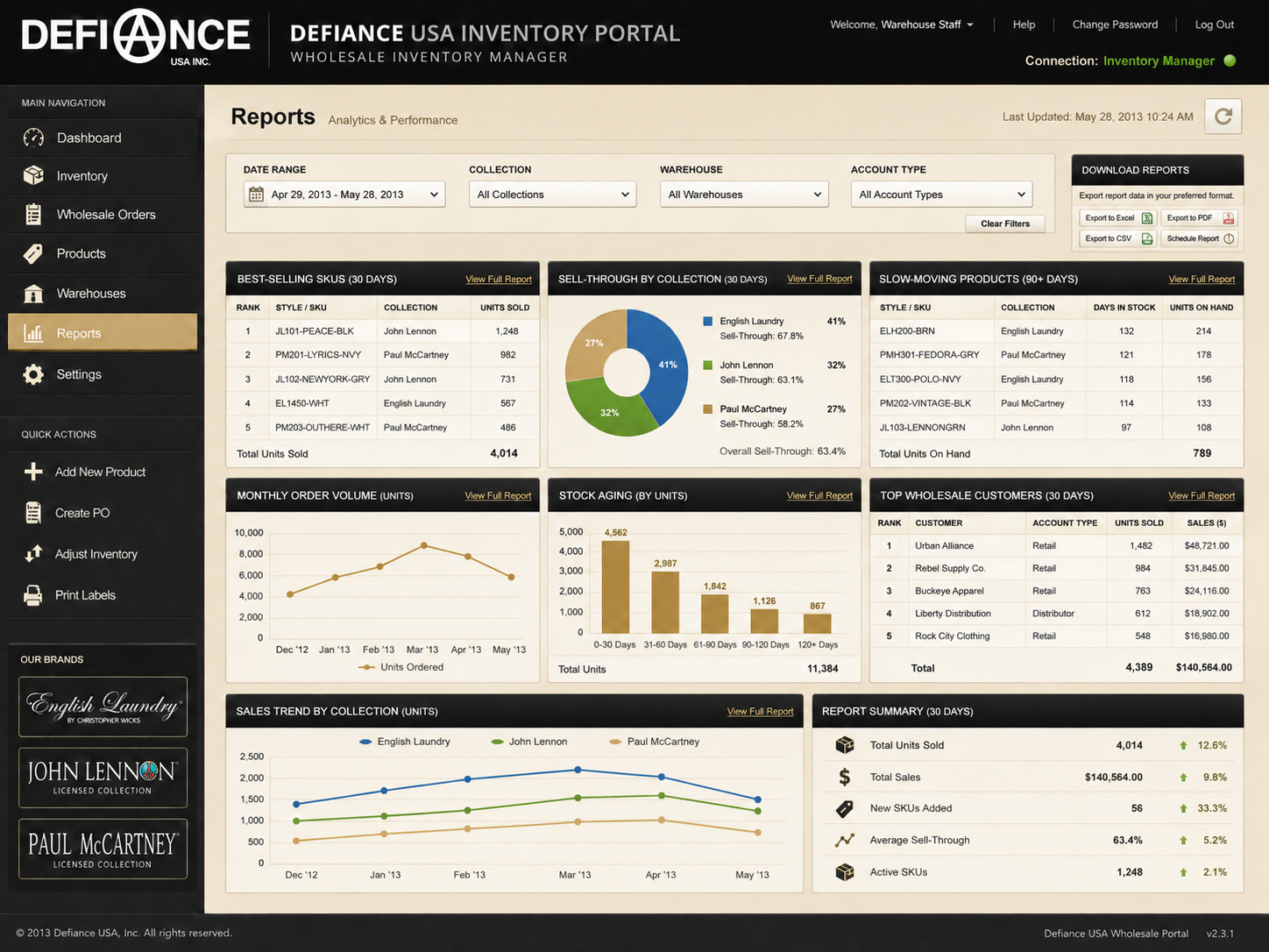
The improved wholesale flow needed to support product browsing, inventory awareness, wholesale order selection, order submission, warehouse visibility, sales tracking, and inventory manager connection.
Connect Ordering Behavior With Inventory Insight
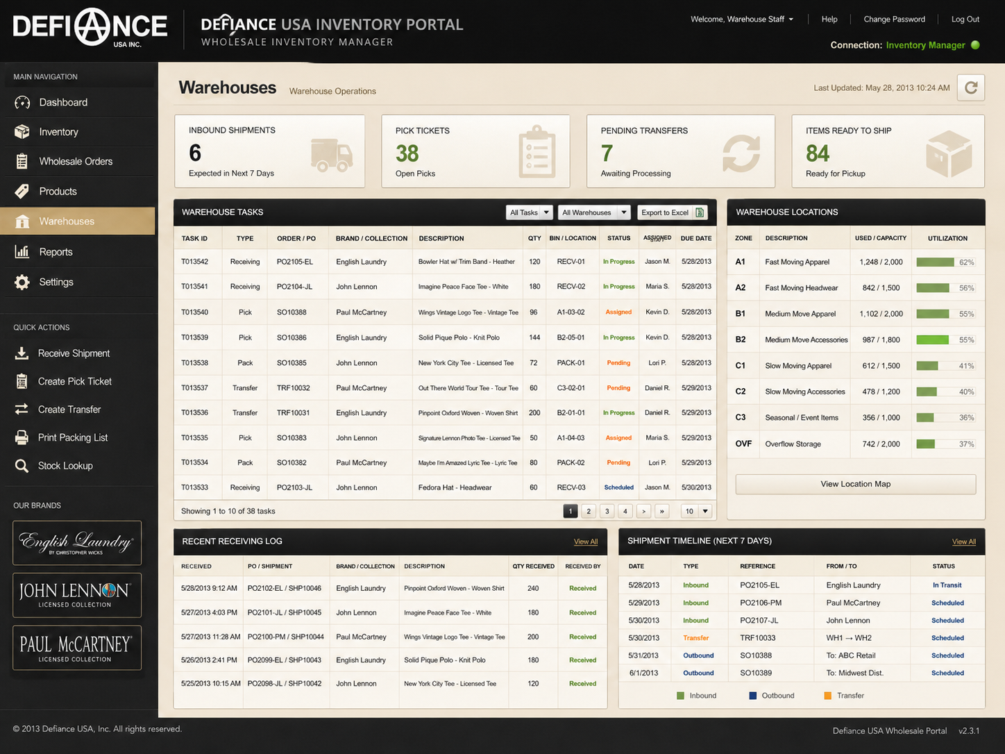
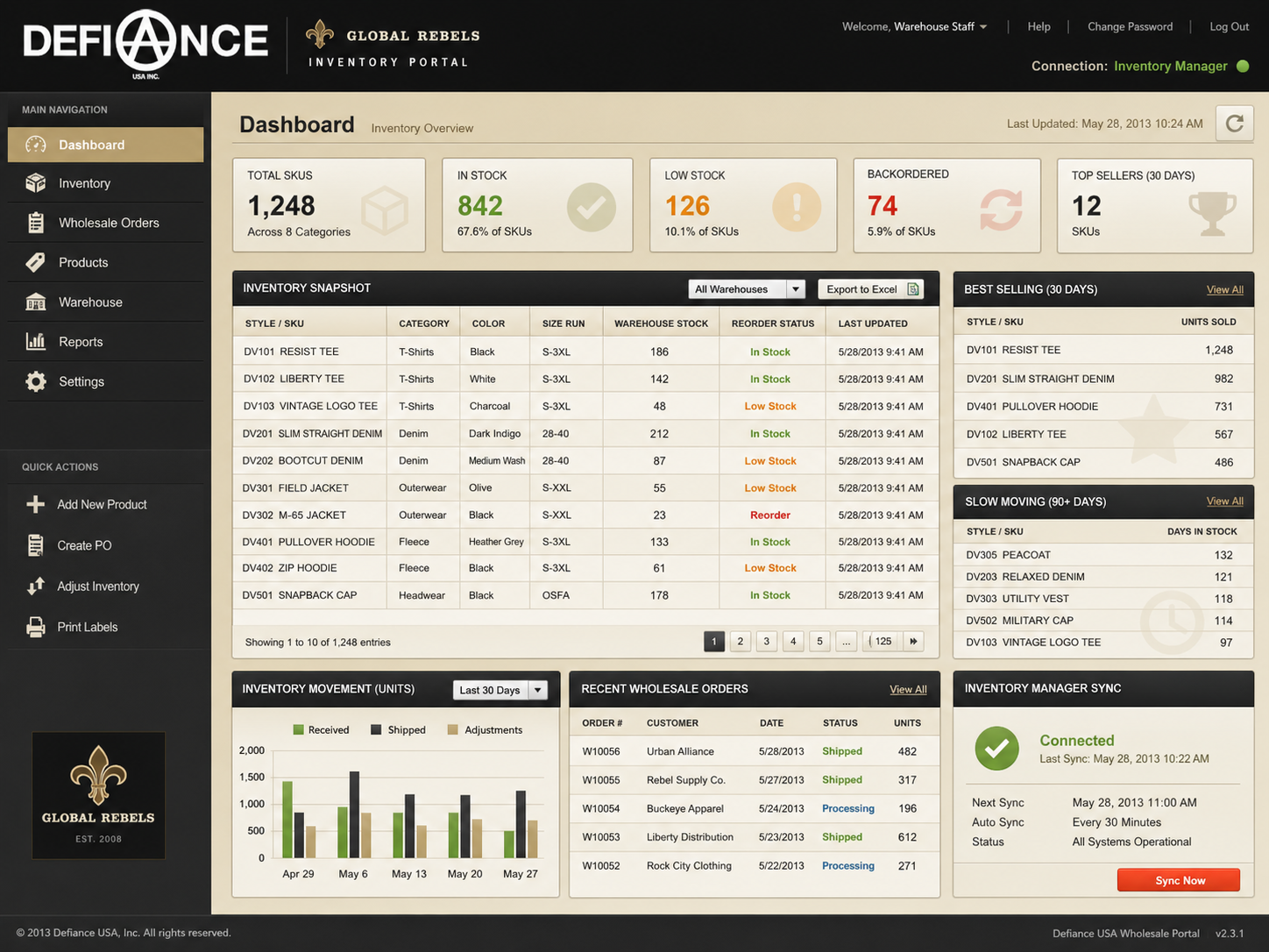
A major business decision was to connect the ordering system with the wholesale inventory manager used by the warehouse manager.
This was important because the company needed better visibility into product movement.
The improved system could help answer:
- Which items are selling most?
- Which items are not moving?
- What inventory needs to be monitored?
- Which products may need more promotion?
- Which wholesale orders are affecting warehouse stock?
This created value beyond the customer-facing website. The project supported both buyer experience and internal decision-making.
Improve Navigation Around Business Priorities
The website flow needed to make the company’s priorities easier to understand.
Rather than presenting Defiance USA as a generic corporate website, the experience needed to guide visitors based on action.
The key navigation logic became:
- Wholesale customers should not have to search for the portal.
- Retail customers should not be trapped on a corporate page.
- Business visitors should understand the brand relationship.
- Internal teams should benefit from cleaner ordering and inventory visibility.
This made the redesign more strategic. It was not just about pages. It was about routing the right user to the right destination.
Result
A More Useful Corporate Website
The Defiance USA website became more than a simple B2B portal entry point. The redesign expanded its role into a clearer corporate hub that could support both wholesale and retail business goals.
Instead of only asking, “How do we send wholesale users to the portal?” the redesign asked, “How should Defiance USA help different users move through the business?”
Clearer User Pathways
The improved experience created clearer pathways for wholesale buyers, retail customers, corporate visitors, and internal staff.
This improved the overall flow and reduced the risk of users landing on the site without knowing what to do next.
Better Support for Ecommerce Traffic
By adding stronger pathways to the Global Rebels ecommerce website, Defiance USA became a support channel for direct-to-consumer discovery.
This helped the corporate site contribute to ecommerce visibility instead of only serving wholesale traffic.
Improved Wholesale Ordering Operations
Fixing the B2B ordering platform helped support the wholesale side of the business more directly.
The ordering system became more useful when connected with warehouse inventory needs. This made it easier for the company to understand product movement and support wholesale buyers with more accurate operational information.
Stronger Inventory Awareness
Connecting the B2B platform with the wholesale inventory manager helped the company better understand what was selling and what was not.
This created a more useful feedback loop between wholesale orders, warehouse inventory, product performance, sales decision-making, and inventory planning.
KPI and Measurement Opportunities
Since this was a practical redesign and system improvement project, success could be measured through directional business and UX indicators rather than only visual design outcomes.
Potential KPI areas included increased visits from Defiance USA to Global Rebels ecommerce, increased wholesale portal usage, reduced ordering friction for B2B customers, fewer manual support needs around wholesale ordering, better visibility into best-selling products, better visibility into slow-moving inventory, more efficient warehouse inventory coordination, and clearer separation between retail and wholesale user paths.
The most important result was that the website and B2B platform became more aligned with how the business actually operated.
Reflections
This project taught me that a corporate website can be much more than a simple informational page. When designed with business flow in mind, it can become a routing system that connects different users to different parts of the company.
The biggest lesson was that UX does not always happen inside a polished app or a full product design process. Sometimes UX means fixing a broken business path, clarifying user intent, improving navigation, and making sure the front-end experience connects to real operational needs.
For Defiance USA, the most valuable improvement was not only visual. It was structural.
The website needed to support the relationship between corporate identity, wholesale ordering, ecommerce discovery, and warehouse inventory management. Once those pieces were connected more clearly, the website became more useful to both customers and the internal business.
If I were continuing this project today, I would focus on deeper measurement and optimization. I would track wholesale portal usage, ecommerce referral clicks, order completion issues, most-viewed products, best-selling inventory, and abandoned ordering behavior.
I would also improve the customer experience with clearer product availability messages, better wholesale onboarding, and stronger reporting dashboards for internal teams.
This project showed me that even a simple redesign can have meaningful UX impact when it improves the way customers, staff, and business systems work together.