SaaS UX/UI
Autify
Clarified Autify's global product story by redesigning its website architecture, user flow, and scalable SaaS design system for an AI test automation platform.
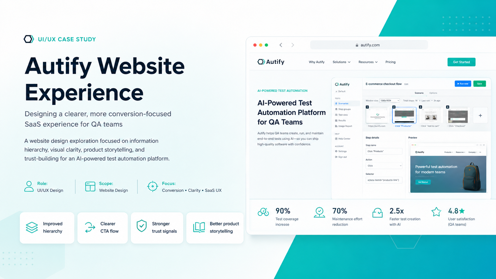
Autify's product direction was evolving, but the website needed to explain multiple product paths, global positioning, and user journeys without overwhelming visitors.
The redesigned experience made product discovery clearer, improved user flow, strengthened conversion paths, and supported Autify's transition into a broader AI-based testing platform.
Quick Context
Autify is an AI-based software test automation platform helping teams automate software testing without relying heavily on traditional code-heavy QA workflows. I was hired as a web designer with UI/UX skills to support a major website redesign initiative across Autify’s global web presence.
The project was not just a visual refresh. Autify was evolving its product direction, expanding its global market positioning, and introducing new product offerings. The website needed to communicate this shift clearly, guide users toward the right solution, and improve key performance indicators such as traffic, conversions, bounce rate, and engagement.
My role included website design, UI/UX strategy, competitor analysis, market research, persona development, user flow improvements, and design system refinement. I helped Autify redesign both their no-code product website and their main corporate/product website, while supporting a clearer separation between global, Japanese, and product-specific experiences.
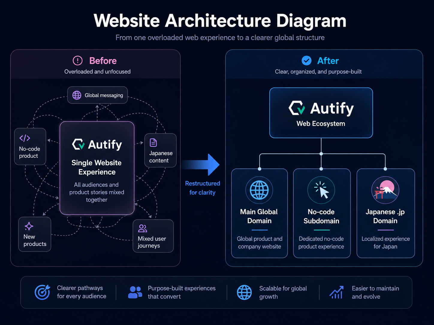 Website architecture and product separation - open larger
Problems
The Product Story Was Becoming Hard to Understand
Autify had a strong product offering, but the website experience did not clearly communicate how the platform fit different user needs. As Autify expanded beyond its original no-code automation positioning, the website needed to explain multiple product paths without overwhelming visitors.
Users needed to quickly understand what Autify does, which product was right for them, how Autify compared to other test automation tools, whether the platform worked for global teams, and whether it supported no-code, AI-assisted, or more advanced testing workflows.
The existing website structure created friction because the product narrative was trying to serve multiple audiences from one destination. This made the user journey less focused and increased the risk of visitors leaving before understanding the value proposition.
Global Positioning Needed More Strategic Clarity
One of the biggest challenges was understanding the direction Autify wanted to take for the global market. The company had to balance its Japanese roots, global expansion, and evolving product suite.
The website needed to feel credible for international SaaS buyers while still supporting the needs of Japanese users. This created a strategic challenge around domain structure, localization, messaging, and visual identity.
Eventually, Autify moved toward a clearer web architecture:
- The no-code product experience was separated into its own subdomain.
- The main global website was redesigned to promote newer product offerings.
- The Japanese website was moved to its own .jp domain.
- The main website adopted a more modern dark color palette to better represent Autify’s next stage.
The Previous User Flow Did Not Guide Visitors Clearly Enough
Before the redesign, visitors had fewer clear decision points. A user interested in no-code automation, a QA leader exploring AI testing, or an enterprise buyer evaluating new products could all land in similar paths without enough guidance.
This created problems around product discovery, conversion clarity, content hierarchy, CTA placement, user education, bounce rate, and product fit.
The core UX question became: how can we help different types of users quickly understand which Autify product is right for them?
The Design System Needed to Evolve
Autify already had an existing design language, but the redesign required a more mature and scalable system. The visual direction had to support a modern SaaS company competing in the AI and automation space.
The design system needed updates across color palette, typography hierarchy, CTA styles, product cards, navigation patterns, landing page sections, trust-building components, conversion modules, and localization-friendly layouts.
Internal Organization Created Execution Challenges
Another challenge was the complexity of the project itself. The website work involved multiple moving parts: the main domain, no-code product experience, Japanese localization, new product positioning, and design system updates.
The organization of content, assets, and stakeholder direction was sometimes chaotic. A major part of the work was bringing structure to that ambiguity and translating evolving business decisions into usable web experiences.
UX Research & Discovery
Competitor Analysis
I reviewed competitors in the software testing, automation, QA, and AI-assisted testing space to understand how similar platforms communicated their value.
The analysis focused on product positioning, homepage messaging, feature comparison patterns, enterprise trust signals, demo and conversion flows, navigation structure, pricing or product segmentation, and how AI and no-code capabilities were framed.
This helped identify opportunities for Autify to stand out as a modern, AI-powered testing platform without overwhelming users with technical complexity.
Market Research
The market research focused on how global SaaS buyers evaluate test automation tools. Many potential users are not only looking for features. They are looking for confidence.
Visitors needed answers to questions such as:
- Can this reduce QA workload?
- Is this realistic for non-engineers?
- Can my engineering team trust it?
- Does it work across modern development workflows?
- Is it scalable for growing teams?
- Is the platform mature enough for global businesses?
This shifted the website strategy from simply explaining features to communicating outcomes: faster testing, reduced manual work, better release confidence, and easier automation adoption.
User Personas
Three key personas helped shape the redesign direction.
The QA Manager needs to improve testing coverage, reduce repetitive manual testing, and help the team release with more confidence. The Engineering or Product Leader cares about delivery speed, product quality, team efficiency, and reducing bottlenecks between engineering and QA. The No-Code Automation User may not have deep coding experience but still needs to create, run, and manage automated tests.
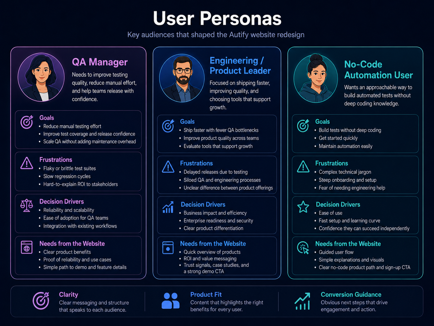 User personas and buying questions - open larger
Decisions
Split the No-Code Product Into a Dedicated Subdomain
One of the most important strategic decisions was separating the no-code product experience from the main website.
This allowed the no-code product to have its own focused story, audience, and conversion path. Instead of forcing every visitor through the same product narrative, the subdomain created a more specific experience for users looking for no-code automation.
This improved clarity by allowing the no-code site to focus on ease of use, speed of setup, non-technical adoption, visual test creation, reduced engineering dependency, and simple conversion paths.
Redesign the Main Website Around New Product Positioning
The main website was redesigned to better support Autify’s broader product direction. Rather than positioning the company only around no-code automation, the new website needed to communicate a more advanced, future-facing product ecosystem.
The updated main domain focused on new product offerings, AI-powered testing, enterprise credibility, global market appeal, stronger product differentiation, and a more mature SaaS visual language.
The visual direction moved toward a darker, more modern palette. This helped the site feel more technical, premium, and aligned with Autify’s positioning as an AI-driven software testing platform.
Move the Japanese Website to a Dedicated .jp Domain
Autify also separated the Japanese website into its own .jp domain. This helped reduce confusion between global and Japanese audiences.
From a UX and localization standpoint, this created a cleaner structure: global users could experience a site tailored to international positioning, Japanese users could access content more relevant to their market, and marketing and SEO strategies could be better separated by region.
Rebuild the User Flow Around Product Fit
The redesigned flow focused on helping visitors self-identify their needs earlier.
Instead of presenting Autify as a single broad solution, the new experience guided users toward the most relevant product path based on intent. The improved flow helped users understand which product matched their testing needs, whether they were looking for no-code automation or newer product capabilities, how Autify could support different team structures, why AI-based test automation mattered, and what action to take next.
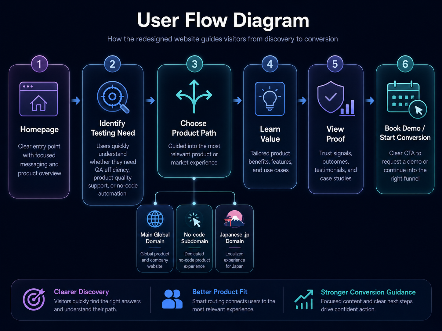 Redesigned user flow around product fit - open larger
Update the Design System for Scalability
The design system was refined to support a more consistent and scalable website experience.
Key updates included a more modern dark color palette for the main website, clearer typography hierarchy, stronger CTA contrast, structured product sections, reusable SaaS-style cards, improved spacing and layout rhythm, better visual separation between product modules, consistent trust and proof sections, and components that could support global and localized pages.
The goal was not only to make the site look better, but to make it easier to expand as Autify’s product ecosystem grew.
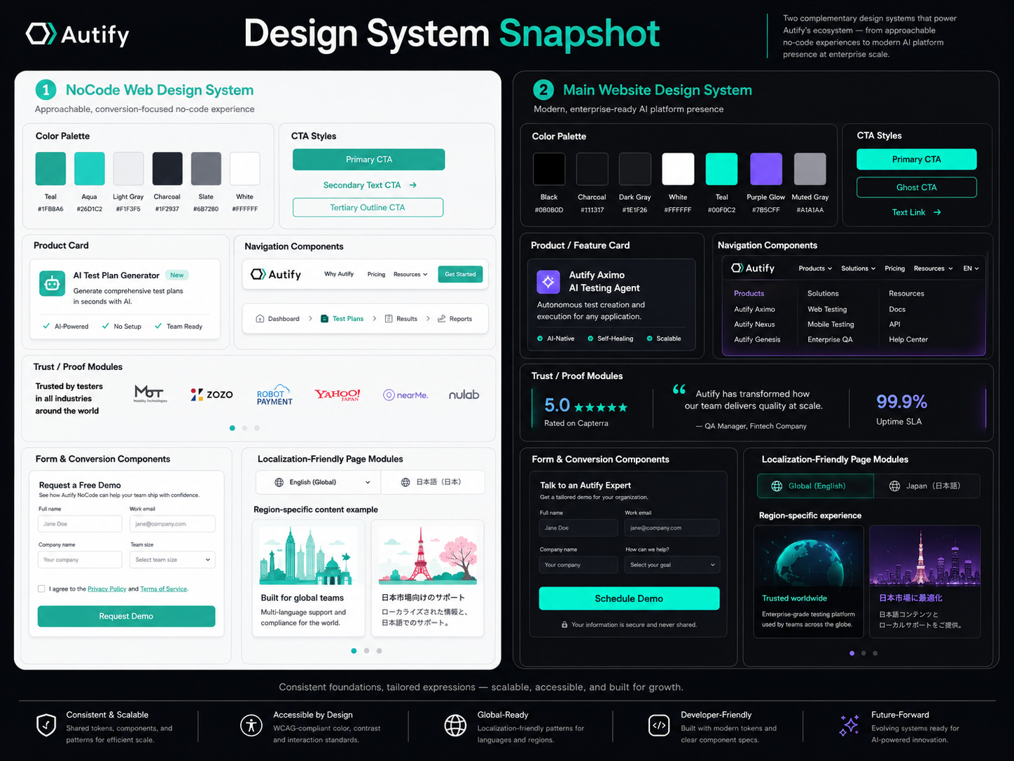 Scalable website design system - open larger
Result
After the redesign and restructuring, Autify’s website experience became clearer, more modern, and better aligned with the company’s global direction.
The biggest improvement was the user flow. Visitors could more easily understand what Autify offered, which product path fit their needs, and why the platform was valuable.
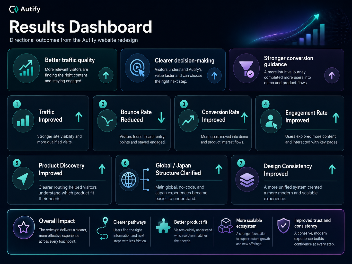 Redesign result summary - open larger
The project contributed to positive movement across key website goals:
- Traffic improved after the site structure and product positioning became clearer.
- Conversion performance improved through stronger CTAs and more focused user journeys.
- Bounce rate decreased as visitors had clearer paths to follow.
- Engagement improved because the content hierarchy better matched user intent.
- Product discovery became easier across the no-code site, main site, and localized Japanese experience.
- The design system became more consistent and scalable.
- The website better supported Autify’s transition into a broader AI-based testing platform.
Most importantly, the redesigned experience helped Autify tell a more mature product story. The website no longer had to force every user into one generic journey. Instead, it gave different audiences a clearer path based on their needs.
Reflections
This project taught me how important information architecture and product positioning are in a website redesign.
At first glance, the work could have been seen as a visual refresh. But the deeper challenge was strategic: Autify was changing how it wanted to present itself to the global market. The website had to support that shift.
I learned that when a company has multiple products, markets, and audiences, design needs to create clarity before it creates visual polish. A beautiful website is not enough if users do not understand where to go or why a product matters.
This project also reinforced the importance of flexible design systems. As Autify’s product direction evolved, the design system needed to support new pages, new product narratives, and different regional experiences without becoming inconsistent.
In future projects, I would try to bring even more structure earlier in the process through stakeholder workshops, content audits, and clearer decision frameworks. When organization is chaotic, design can become a tool for alignment. The more clearly the team understands the product story, the easier it becomes to create a website that performs.